Digital Editing 102: Making it Sing
Project 1: easy does it
page 4, version 1.3, © 2009 by Dale Cotton, all rights reserved.
D. Local changes 3: global and local sharpening
Next up: we need to tackle another task: unsharp masking (USM). Like everything else I've been doing to this picture, my sharpening approach is in direct contravention to all that's currently sacred and in vogue in the Photoshop Gospel. I don't find it necessary to separate sharpening in to three stages. I don't always sharpen on a separate layer or separate copy of the image file after all other editing is finished. Artists are used to making decisions then acting on them – what can I say? ;)
The camera I used to take this picture (Pentax K20D) gives beautiful results at low ISOs but has a strong anti-aliasing filter over the sensor, which results in more out-of-camera softness than some other cameras produce. We'll need to compensate for that with a fairly aggressive initial USM attack:
1. Optionally duplicate the background as a new layer.
2. Change to 100% mag and find a section of the image with a range of different types of detail to work with.
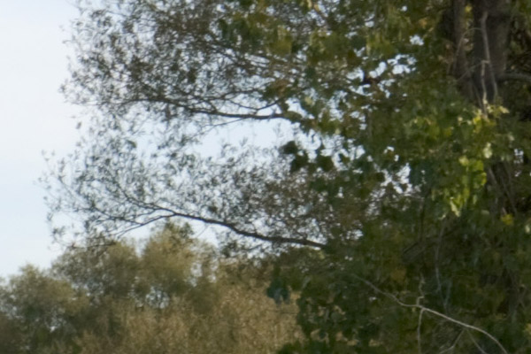
Fig. 15: crop at 100% mag. before USM
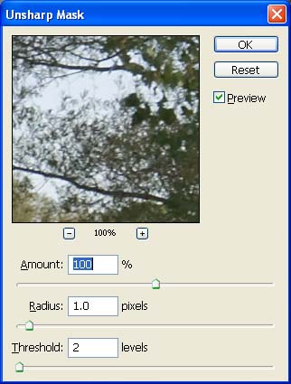
Fig. 16: First USM pass
3. Open the USM dialogue, then set radius to 1.0, strength to 100, and threshold to 2; apply.
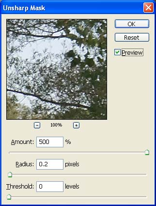
Fig. 17: Second USM pass
4. Re-open the USM dialogue, then set radius to 0.2, strength to 500, and threshold to 0; apply.
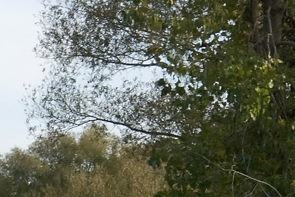
Fig. 16: crop at 100% mag. after USM
(Notice how the smallish dose of radius 1 USM does most of the heavy lifting, then the 0.2 radius finishes off by snapping the finest level of detail into focus.)
5. Set the history brush marker to the step just before the first USM. Continuing at 100% mag. and jumping to 200% as needed, patiently peruse the entire image; wherever you see haloing or simply edges that are too sharp compared to the rest of the image, use the history brush at around 25% to restore some softness. We see a good example in Fig. 16: the branches against the sky show clear haloing. On the other hand, the region beyond the yellow pipe and along the path is beyond DOF and should be slightly out of focus, so apply history brush there too, as needed.
6. Now review the entire image again, this time looking for areas that are inappropriately soft (often at the edges of the frame). In this image there are regions in the shadow areas of the far right trees that are still soft; make a feathered selection of these then apply USM at something like 75, 0.5, 0.
E. Printing
If you've been following along, you've now got a full-scale (15 megapixel), print-ready image file. The sort of finicky editing we've done will largely be wasted if we should now send the image file to a budget-priced, dye-based inkjet printer. But if you have a pigment-based, profiled printer you may want to make a print.
If you've done your USM homework diligently, ;) you've now got an image file that can withstand printing as large as 13 x 19.5" or even a bit more. I personally don't find up-sampling allows me to go larger, but others argue passionately that this can be made to work.
1. With your final edit of the image open in Photoshop or similar editor, set the PPI (pixels per inch, often mis-labelled DPI) to any number down to 240. For example, 467 PPI produces print dimensions of 10 x 6.65", which will fit nicely on letter-size or A3 paper.
I urge you to make at least one print without up-sampling and with PP1 set no lower than 280. In my experience one of the key differentiators between gallery-grade and wanna-be work is in the clarity and smoothness of fine detail. 280 PPI will produce what I consider to be a gallery-grade 11 x 17" print.
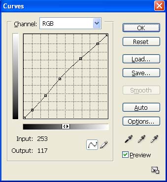
Fig. 17: Printing curve
2. Either work with a copy of the image or add a new layer; then create a curve as in Fig. 17. This increase in mid-tone brightness will compensate for the inevitable loss of brightness and contrast when going from screen to ink on paper. (In Photoshop you can preview this effect and tweak your adjustment curve by using the Soft Proof feature.) The curve in Fig. 17 should work fine for most photo papers, such as a resin-coated luster or satin like Epson's Premium Luster or Ilford's Gallerie Pearl. If you're using a matte paper, you'll need to exaggerate the mid-tone hump.
The paper I use for personal (non-sales) prints is Epson Proofing Paper White Semimatte. I buy it by the 100 sheet, 13x19", box (S042118), and go through them like water. (How times change: as a child I treasured any sheet of paper larger than letter size on the rare occasions I came across one, and hardly dared to use it.) Despite the name, this paper is a warm-tone white that's almost identical to the colour of Ilford's pro-grade Gold Fibre Silk (and is perfect for proofing the more-expensive Ilford and other warm-toned baryta stocks). If you also prefer a warm-tone white, I highly recommend this paper.
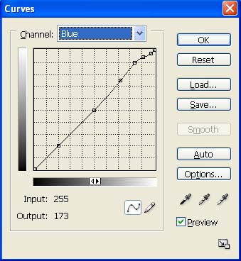
Fig. 18: Blue channel curve for warm-toned paper
3. If you're using a warm-toned paper, one issue is that the slight yellowish tint of the paper itself tinges very pale (pastel) hues, especially sky blue. For this reason I modify the blue channel of my print curve as in Fig. 18 to compensate for the yellow tint on images like this one in which cool pastel colours like sky blue are important. This is a bit of admittedly a kludge, but I do find it to be an improvement, if not perfect. Notice how the curve rises near the top then comes back down again in order not to add a blue tinge to cloud whites. You could even tweak the blue channel for each image, since the relative brightness of the sky varies from scene to scene.
This is a lot of trouble just to use warm-tone paper, I know: but there are three reasons beside personal preference to do so. One: the rare sort of connoisseur who buys original artwork will have a strong preference for traditional art papers like Hahnemühle and Arches, all of which are warm-toned. Two: non-warm-toned papers (bright white) are created by adding bluing agents called optical brighteners; these have a reputation for not being archival. Three: warm-toned fibre baryta stock like Ilford's Gold Fibre Silk, Epson's Exhibition Fibre, and Inkpress' Baryta Warm-Tone have become the go-to papers for gallery-quality photography. If you have aspirations to compete in that market, you may as well start learning the ropes.
4. In the Print dialogue, enable profiled printing, select the profile for the particular paper you're using, use your finest detail setting, then send the job off to your printer.
De-brief
The raw file we started with is a happy combination of proper exposure, good focus, and a pleasing composition. The changes needed to make this shot sing were relatively minor, and the approach I took was exceptionally conservative by my lights. Don't worry: we'll push the envelope a bit further in project 2. ;)