Adjusting your monitor

Graphics professionals and serious amateur use a hardware device to profile their displays. Failing that, the following instructions will help you adjust your monitor fairly close to the standard used by this and most other photography and art sites. Some of these settings are controlled by your monitor control panel, some within your operating system. LCD displays may lack some of these adjustments:
Laptops: If you're viewing a typical laptop screen, you've probably already realized that screen tilt is absolutely critical. Unless the display is perfectly parallel to your line of sight, both brightness and colour will be wonky. This is also true for budget to mid-range desktop LCDs, but usually less obviously so.
To centre your screen turn the display off so you see blackness. Using your faint reflection as a mirror, adjust the tilt so your eyes are in the middle of the screen.
Dimensions: Use at least 1024x768 (preferred: 1280x1024 or larger) display area and 16-bit (or higher) colour depth.
Gamma (brightness curve): All my pictures and the vast majority of all pictures on the web are adjusted for a monitor gamma of 2.2, which is the PC default and how most people instinctively set their monitors. Each image also includes a profile, so Mac users still at 1.8 should also see them correctly.
Note: The following black and white point settings are sensitive to the light level in the room you are viewing your monitor in.
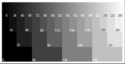
Black point: The 0 swatch in the above grey scale should be pure black. 8 may not be distinguishable from 0, but 16 should be - just barely. Use the Brightness control on your monitor to control your black point. Note: not available on some LCD displays.
White point: The border of the above grey scale should be pure white; 248 should be distinguishable from the border. Use the Contrast control on your display to control your white point.
Please read this excellent tutorial on your "Brightness" and "Contrast" controls by Charles Poynton for very clear instructions on the above.
Colour purity: The squares in the above grey scale should be a pure shade of grey with no tinge of any other colour. If you are not using a monitor profile or Adobe Gamma, adjust your colours via your monitor control panel. Professionals use a colour temperature of D65 or 6500°. If you are used to 9300°, you may find that 6500° initially looks a little reddish and dull - stick with it if you can. In more recent years the native white point of LCD monitors are moving closer to 6500°, so this is becoming less of an issue.