A Survey of Inkjet Fibre Papers
A look at what's available as of 2011
Page 1 of 3. Version 1.0, ©2011 by Dale Cotton, all rights reserved.
This report attempts to give a fairly non-subjective picture of many of the gallery-quality inkjet papers available as of 2011. To skip ahead to the actual paper descriptions, click here. To jump to a specific paper:
- Ilford Galerie Gold Fibre Silk
- Inkpress Warm Tone Baryta
- Hahnemühle Photo Rag Baryta
- Hahnemühle FineArt Pearl
- Hahnemühle Photo Rag Pearl
- Hahnemühle FineArt Baryta
- Hahnemühle Photo Rag Satin
- Epson Exhibition Fiber Paper
- Intelicoat Museo Silver Rag
- Canson Infinity Platine Rag
Background
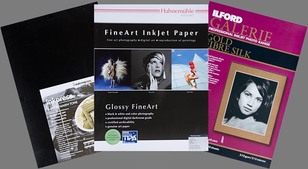
Fig. 1: Some inkjet fibre papers
Probably 98% of all digital photographs never get printed on paper. Of those that do get printed, at least 98% are printed on something called RC photo paper. Only a very small proportion get printed on any of the hundreds of high quality "art" papers that have exploded on to the scene in the past few years.
If you took a roll of 35mm film to your local micro-lab to have prints made a decade ago, you would normally have got back a set of 4x6 inch prints on a fairly glossy white paper with a plasticky feel and a surface texture composed of very tiny bumps. This is called resin-coated photo paper, or RC for short, and Fuji Crystal Archive happens to be the brand name of one of the most common products in that arena. RC is the culmination of many decades of refinement in photo paper. It's white colour and glossy surface are necessary to ensure that even the most contrasty, brilliantly coloured image is optimally reproduced. The plasticky, slick feel is the result, not of being made out of plastic, but of a pure chemical coating called polyethelene, that renders the paper highly resistant to scuffing, staining, and water damage. The artificially textured surface adds to its toughness, while helping break up reflections from the glossy sheen.
On the other hand, if you'd developed that roll of 35mm film yourself and set about printing it in a darkroom, you'd be more likely to use something called a fibre paper and obsess over choosing just the right air-dried surface texture and sheen. Fibre prints had a quality cachet that commercial RC prints lacked, but were delicate and meant to be handled carefully by experienced hands or framed. Darkroom fibre prints typically contained a baryta (barium sulfide) coating to whiten and buffer acidity.
This was the situation when photo quality inkjet printers appeared about a decade ago. The first and easiest task inkjet companies faced was to adapt film-purposed RC papers for inkjet printing; and this goal was met within the first few years. As inkjet printers evolved it gradually became apparent that the technology was maturing to at least equal the common darkroom and micro-lab technologies of the preceding film era. RC inkjet papers like Epson Premium Luster and Ilford Gallerie nicely handled the large demand for commercial-grade printing. What was needed was the equivalent of the darkroom fibre papers used for fine art photography.
The first stab at this was an attempt to adapt familiar matte surface papers from the watercolour painting world for use with inkjet printers. Many coatings were tried, and the results may well have been successful for the reproduction of watercolour paintings, but the results were less than satisfactory for general photography: black was charcoal grey, colours were less than vivid. Nevertheless, for a certain subset of photographic images the combination of matte finish and finely textured surfaces works very well indeed.
Only in the past five years has the challenge of creating the inkjet equivalent of an air-dried fibre print been seriousy addressed. This started when the first inkjet-compatible baryta coating was developed. We now have a dizzying panoply of fibre inkjet papers to choose from, and they have many of the characteristics of darkroom fibre papers, while retaining the excellent black and vivid colour reproduction of inkjet RC paper. The one characteristic of darkroom papers that remains to be addressed for many a darkroom veteran is the delicate surface texture often seen in darkroom prints.
Worlds in collision
To my mind, the twin issues of paper colour and surface texture represents a battle ground between the paper mills and the world of painting-based galleries and collectors versus darkroom-experienced photographers plus the small subset of collectors with experience in this area versus amateur and new photographers. If you've only ever eaten McDonald's your first experience with European gourmet cooking may come as a shock, and not necessarily a pleasant shock. Similarly, if you grew up on European gourmet cooking then McDonald's will come as a shock, and is pretty much guaranteed not to be a pleasant one.
A paper mill like Arches, Hahnemühle, Canson, Sihl, or Crane with centuries experience creating traditional watercolour papers has a certain bias towards what it believes a classy paper should look and feel like. Painting-based galleries and collectors very definitely share that bias. A manufacturer like Ilford or Kodak with decades of experience making darkroom photo paper has a certain and different bias towards what it believes a classy paper should look and feel like. A re-brander like Epson, HP, or Canon with no other experience except that of trying to read a market dominated by millions of amateurs shares their bias toward the technical perfection and artificiality of RC.
As a photographer, if you are trying to sell your work you need to learn to navigate in whichever of these very different waters you plan to sail in. Taking an RC print to an urban paintings-centric gallery or traditional collector is a waste of their and your time. Showing a cotton rag print at your local county fair or arts and crafts show is a waste of time and money. If you are not trying to sell your work, you need to stick to RC paper and not allow yourself to become corrupted by the money-sink of fine art materials. Hamburger is much less expensive a habit to indulge than filet mignon.
A nicely written polemic on this subject is Richard Lohmann's The Surface of Things. (Bear in mind this was written in 2006; his criticisms of Silver Rag and Innova FibraPrint may long since have been addressed by the respective manufacturers.)
About the paper specs
While the specs section below may seem a bit dry, it's all information that quickly becomes valuable when you become dissatisfied with the paper or papers you've been using then start researching which alternative would give you what you want. There's nothing particularly complex or difficult to understand about any of the information I'm presenting. The problem is the lack of its availability. A spec sheet like this one for Hahnemuhle Photo Rag is a valuable gem compared to this sorry specimen for Warm Tone Baryta from rival Inkpress. It's not that a thorough spec sheet can tell you all you need to know before you buy an expensive box of paper; rather it tells you enough to eliminate whole swaths of products as not being appropriate to your particular needs. Similarly, on-line paper reviews would be hugely more valuable if their authors would assemble as much of the information as they can then include it in tabular form in their review.
A more difficult task for a reviewer is to try to give the reader a sense of the look and feel of a given paper. To say a paper has a pale buff colour and moderately toothy texture is better than nothing, but how to describe the difference in texture between two papers that both meet that description, such as Hahnemuhle Photo Rag Baryta and Inkpress Warm Tone Baryta? I've attempted to photograph the actual textures of the papers I'm reviewing, but the results are far from satisfactory.
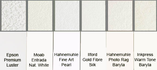
Fig. 3: texture and colour
In Fig. 4, The top strip shows texture, below that paper colour. For reference I've included Epson Premium Luster as a typical OBA-whitened RC, and Moab Entrada Natural White as a typical non-OBA matte/watercolour paper. Be aware that your browser may not be showing you accurate colours in Fig. 3. If they look different from my descriptions below, then ignore the colours in Fig. 3. At least you can see the relative brightness of these papers and something of their texture in the little insets.
Toward a descriptive vocabulary
Ironically, if i can't rely on photography to accurately convey visual information, I'm going to have to fall back on words. We need words to describe the colour, texture, and sheen of different papers.
A word on white. All the photographic papers I've ever seen can be loosely described as being either white or off-white. The word "white", at least, would seem to be something we can all agree on. Unfortunately, that's no longer so. Over the past few years I've noticed a new faux-cognoscenti fad regarding the word white. It now appears to be "in" to maintain that cream is the "real" white and pure snow white is a crass blue-white. The rest of us know what our eyes tell us. If a painter wants pure, neutral white he uses titanium oxide pigment. If he wants a warmer off-white he can add a smidgeon of brown pigment to that. Yes: it's true that OBAs are bluing agents. That blueness is needed to neutralize the cream colour that is the closest to neutral that natural fibres can get. It's also true that a neutral white paper will look slightly bluish in 5000 Kelvin or warmer light. Daylight gets a lot cooler than the 5000 K of morning and evening. In short: for the purposes of this article when I say white I mean snow white, not off-white.
Colour. A paper that is less than glaringly bright white, yet is still neutral, is a very light grey. A paper that is less than glaringly bright white but is warmer than neutral I'm going to call pale cream. A paper that is darker than pale cream I'm going to call medium cream.
The lab colour numbers are courtesy Ernst Dinkla's fine reportage. If you know Photoshop you can plug them in to the colour picker to create a swatch.
Texture. Fibre papers are called that because they're made of a mat of fine fibres or plant-material hairs glued together to form a thin flat sheet. Nevertheless, from what I've read a sheet of fibre paper has no texture unless a textured surface is pressed against it while drying. Photographers who pay big bucks to work with high megapixel cameras then print at high resolutions likely dream of sneaking into paper mills to replace these textured plates with smooth plates. To their eyes paper texture is the enemy of ultra-fine detail. To a painter the organic texture of watercolour paper or canvas enhances the organic (non-regular) pattern of their brush strokes to create value.
I see five factors that go into producing a given paper texture: indentation depth, indentation separation, indentation length, pattern type, and pattern regularity. A typical luster RC paper has a texture composed of closely spaced bumps forming a highly regular pattern at a noticeable depth. Leather has a texture composed of broadly spaced curving lines of fairly deep indentation with no regularity/repetition of pattern.
Sheen. This is a gamut from total liquid-like gloss to total non-reflective matte. All the papers described here are technically "gloss" papers in the sense that they have a clear varnish-like coating over a powder ink-receptive coating over the substrate. Matte papers have no clear coat. The clear coat can be polished to the glass-like shininess we normally think of the word gloss as applying to, or buffed to an nearly matte finish that paper manufacturers call satin. A noticeable texture also serves to reduce the shininess of gloss, as in the pattern of fine bumps impressed into the surface of a luster RC paper. I will try to keep texture and sheen separate by referring to sheen as being high gloss, medium gloss, low gloss, or matte.