Some Masterpieces from the Public Domain
Version 1.1, © 2009, 2012 by Dale Cotton, all rights reserved
Sandro Botticelli
Warning: clotheslessness below.
Update, May 2012: click on links provided for wallpaper-sized versions of select images.
Wikipedia entry for Sandro Botticelli
Botticelli, 1445 to 1510, was a Florentine Renaissance painter, some of whose paintings are now among the best known in the world, although in his later life and after his death his name drifted into obscurity.
Unlike most of the painters represented here, Botticelli worked in tempera, usually on wood panels, occasionally on canvas. Tempera is made from powdered pigments, like oil paints are, but mixed with egg yolk or similar binding materical, instead of oil. Tempera dries rapidly and cannot be applied thickly so colours are more pastel and less vivid (less saturated) than can be achieved with oil paints. Tempera has the profound upside that colours can remain unchanged even over centuries (depending on exposure to pollution), while oil paint yellows with age. The upshot of all this is we only have to compensate for problems with the recording medium, not with the yellowing of the paint in order to get at the colours intended by the artist. Even more so than with oils, we can infer that reproductions with highly vivid/saturated colours are incorrect.
The first picture here is a portrait believed to be of a noble woman named Simonetta Vespucci. While I see much that is masterful about Botticelli's handling of paint and colour in this relatively early work; the draftsmanship is noticeably stiff and laboured.
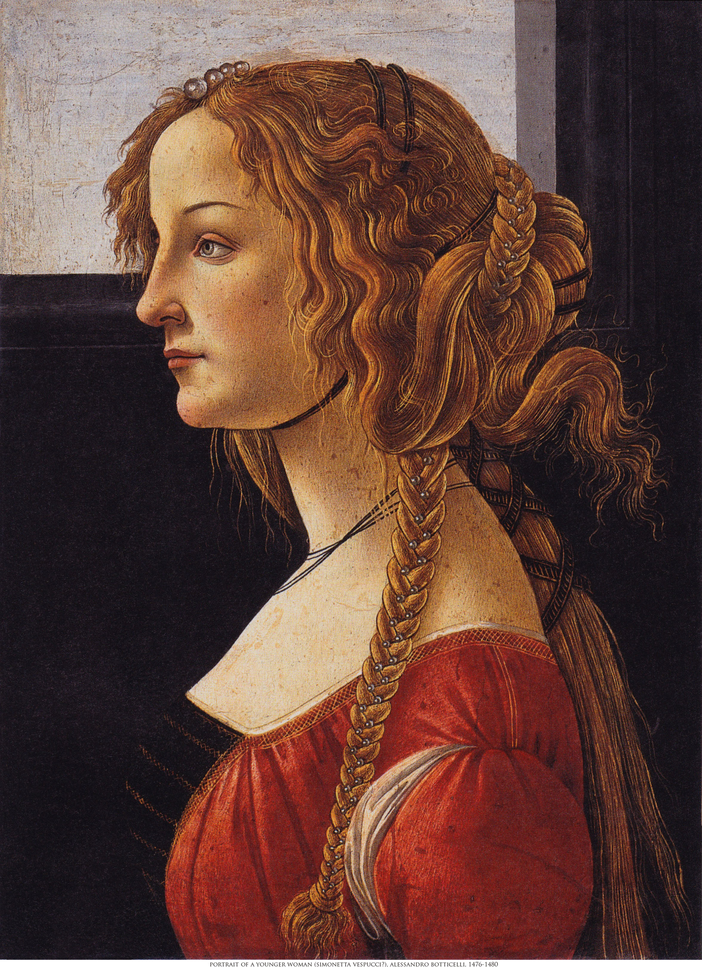
Fig. 3-1: Portrait of a Young Woman (Simonetta_Vespucci), Sandro Botticelli, 1476-1480
We would say today about the next picture, Primavera, that it has gone viral among art historians in that countless interpretations of the story it tells abound. The obvious often gets lost in the complexities of such flights of theory: that when the painter is a young man, any excuse to put on canvas that which fills his sketchbooks – attractive young women, as scantily clothed as possible – is a good excuse. During the Renaissance, Classicism – the imitation and veneration of the surviving art and writing of the ancient Greeks and Romans – was a long-standing fad. I imagine the atmosphere among the monied elite as being something like that at a Star Trek convention; but instead of challenging each other to name Spock's father-in-law, the subject was everything and anything having to do with the ancients, but especially their myths. In short, classical subject matter provided an endless opportunity to paint pretty girls.
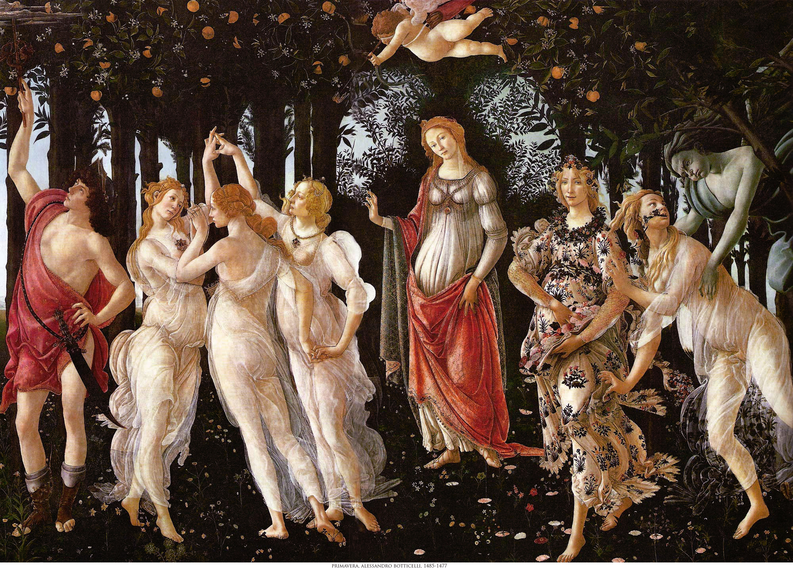
Fig. 3-2: Primavera (Spring), Sandro Botticelli, 1477
[Wikipedia entry] [Wallpaper version]
In the case of Primavera (which means "first green" in Italian, although there is precious little green in this painting) Botticelli chooses to tell the story of spring as the season of romantic attraction. Imagine that you have a print of this painting on paper and you've connected the left and right edges to form a cylinder with the picture on the outside. The action of the scene flows from right to left with Venus in the center presiding over everything, like a motion picture director over a shot or the conductor of an orchestra over a performance. On the right is the first cameo: the frightened nymph Chloris is pursued by Zephyr, god of winds (that blow in the new season of spring). Zephyr's blue/green colouring presumably represents the element air, but also the chill of winter and so connects the current scene to the one which came before. Zephyr is overcome by attraction to Chloris' beauty. Beside Chloris is the goddess Flora, whom Chloris is soon to be transformed into, according to Ovid; Flora is pregnant and scatters flower petals as symbols of fecundity.
The central cameo has Venus' son cupid hovering over her as agent of her intentions or the conductor's baton. Cupid is blind-folded and about to shoot his arrow of amorous enchantment at a woman in the third cameo, on the left. The young woman is the central one of the three Graces; her eye has been caught by the beauty of the oblivious young man on the left: the messenger god, Mercury. Thus, we have both male attraction to female and female attraction to male, as two sides to the same story. Lacking, perhaps in conscious irony, is mutual attraction between the two.
Finally, the backdrop to all this is a bed of what I assume are spring flowers and a grove of trees bearing the first fruits of spring. The impression of fecundity is further emphasized by the suggestion of abdominal swelling in all the women in the scene.
So in a sense we could say Primavera is an allegory; but better to see it as a little story told in visual rather than verbal phrases. So much for the story told by the picture. In terms of execution, I frankly would not have recognized it as being by the same artist. The Portrait's stiffness has been replaced by the complete fluidity of line that only comes as a sea change from apprentice to mastery after long years of practice.
Update: for more on the composition of this painting see here.
This next painting marks the second of three appearances of Venus/Aphrodite on this page. No question that we're dealing with a mature Botticelli painting what he loves best: a Classical theme. The panoramic 2.5 to 1 aspect ratio would do a HDTV owner proud:
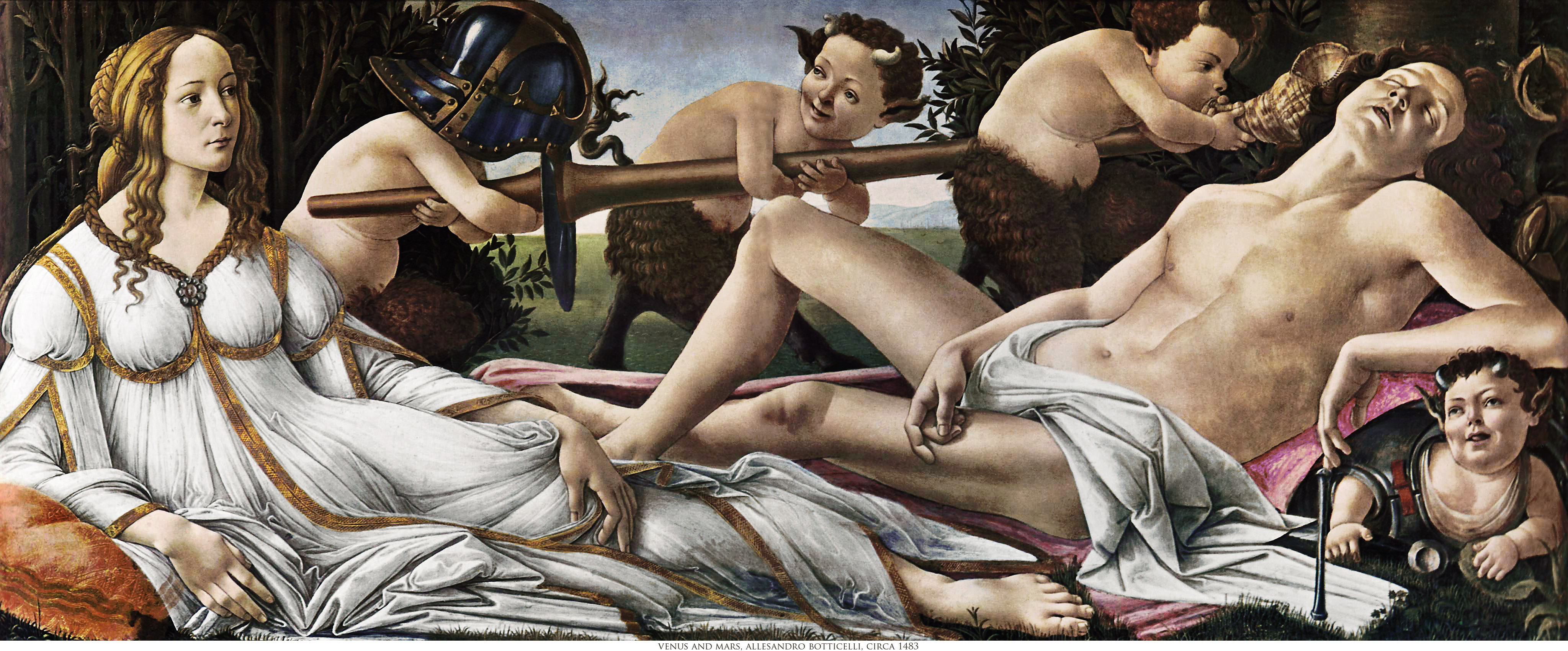
Fig. 3-3: Venus and Mars, Sandro Botticelli, 1483 [Wikipedia entry]
Many historians believe that Simonetta, seen in the Portrait of a Young Woman above, was the model for this next picture; that Sandro fell in love with her during the painting of it; and that he never married, at least in part, because he never fell out of love for her. What is known is that he asked to be buried at her feet and had his wish granted. We can guess that the Portrait is the more accurate of the two likenesses, and the Venus below, the idealization.
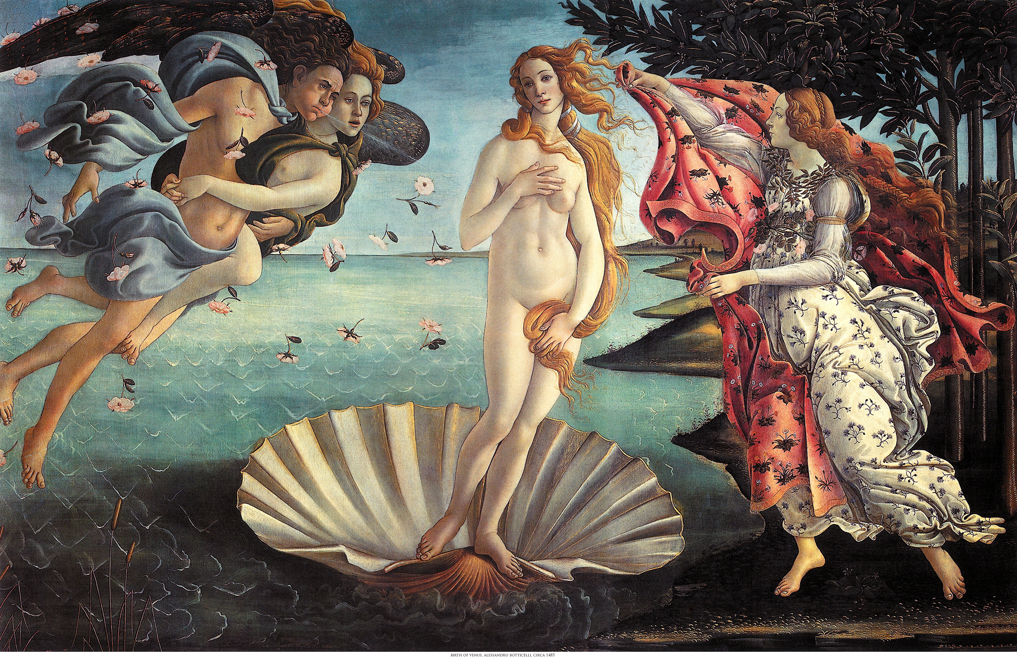
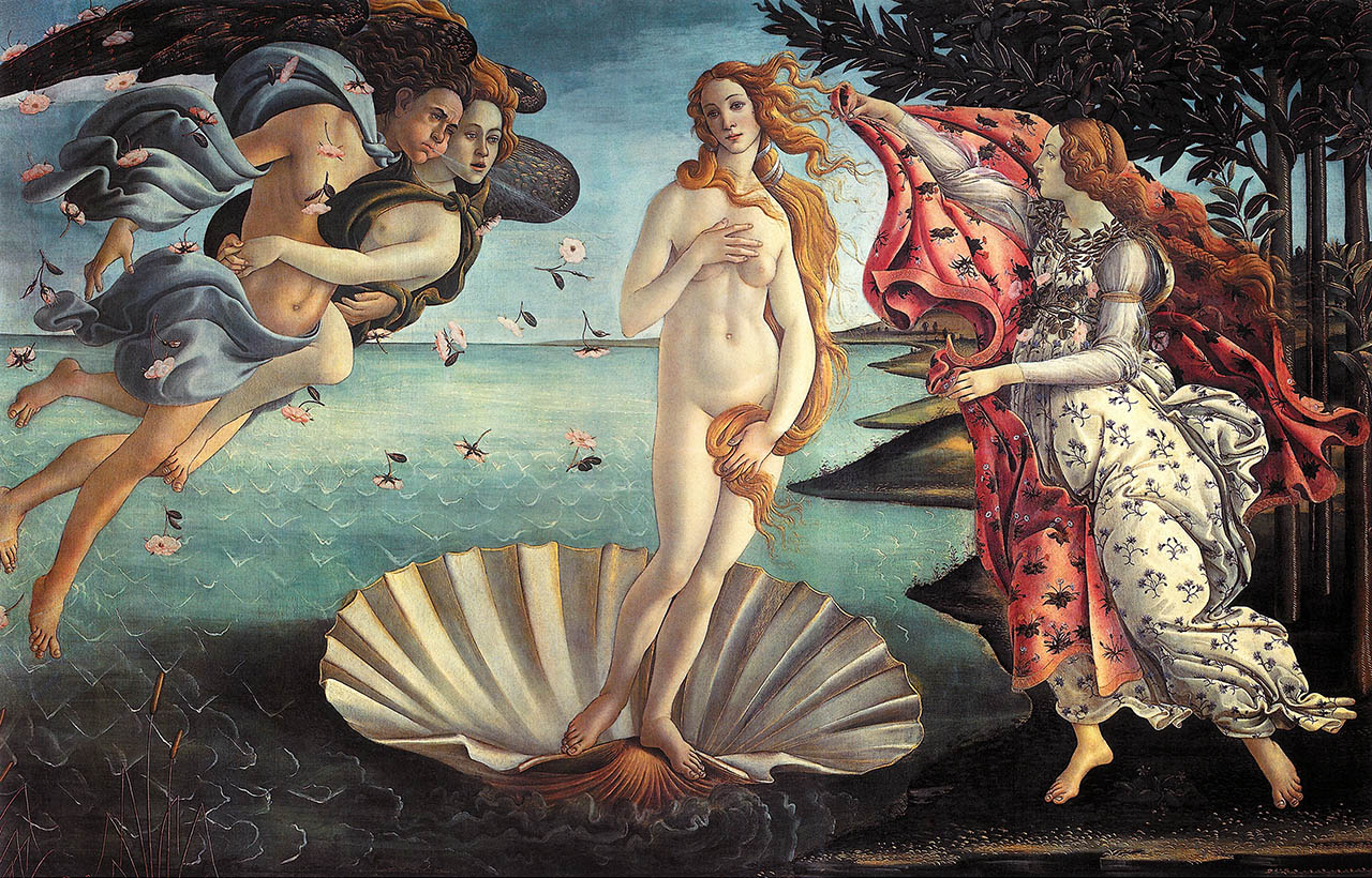
Fig. 3-4: Birth of Venus, Sandro Botticelli, circa 1485 [Wikipedia entry]
[Wallpaper version]
The Birth of Venus is an iconic image and a cliché; but it is also a work of utter mastery. Rather than attempt pure photorealism, Botticelli chooses an almost cartoon-like style of sharp outlines filled in by washes of colour. Today we would call the deliberately crude rendering of the trees, shoreline, and water some form of Rousseauian Primitivism. Botticelli clearly has the skill to work just a realistically as he desires; I conclude that his primitivism is deliberate. Botticelli understands that by simplifying away the level of the smallest and least essential details what is left has all the more visual power. Simplification or no, not only are the outlines gorgeous but the colour washes are divine. Look at how limid and luminous are the colours in Venus' skin. (Yet for all that Botticelli manages to get Venus' left nipple in the wrong place, which suggests along with the sloping shoulders that she was drawn from imagination, not life.)
The story line is simple: we have Modesty attempting to cover the new-born nakedness of Beauty, while the god Zephyr (perhaps with a reconciled Chloris in tow?) attempts to prevent this tragedy from coming to pass.
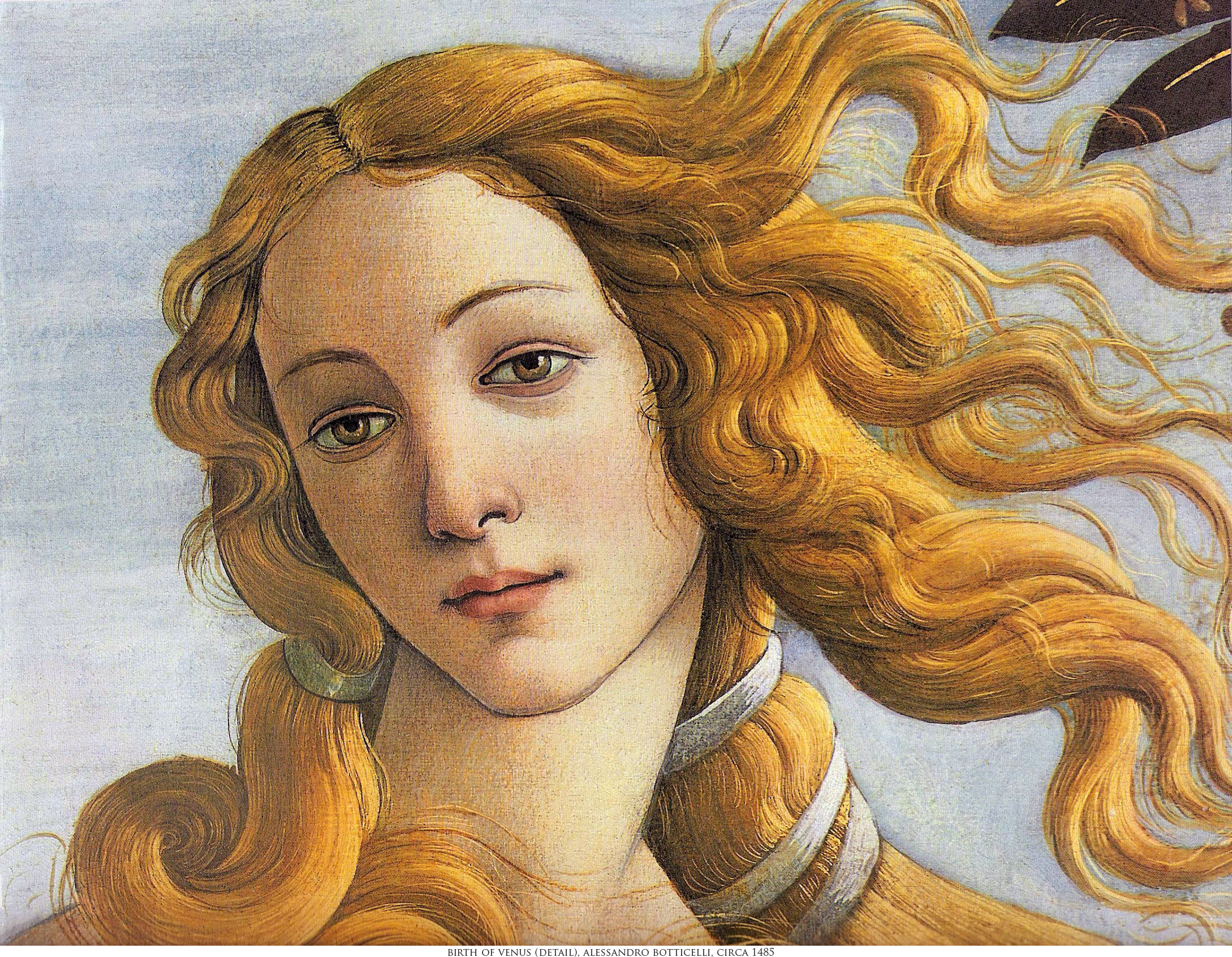
Fig. 3-5: Birth of Venus (detail), Sandro Botticelli, 1485 [Wallpaper version]
This next work finds Botticelli in commission of the church, for a change, instead of the nobility. I had two equally bad image files to work with. One had totally washed-out colours but a usable amount of detail; the other too vivid but otherwise more plausible colours but no detail. This version is my best guess as to the actual colours, but truth will have to await a fully accurate capture of the original:
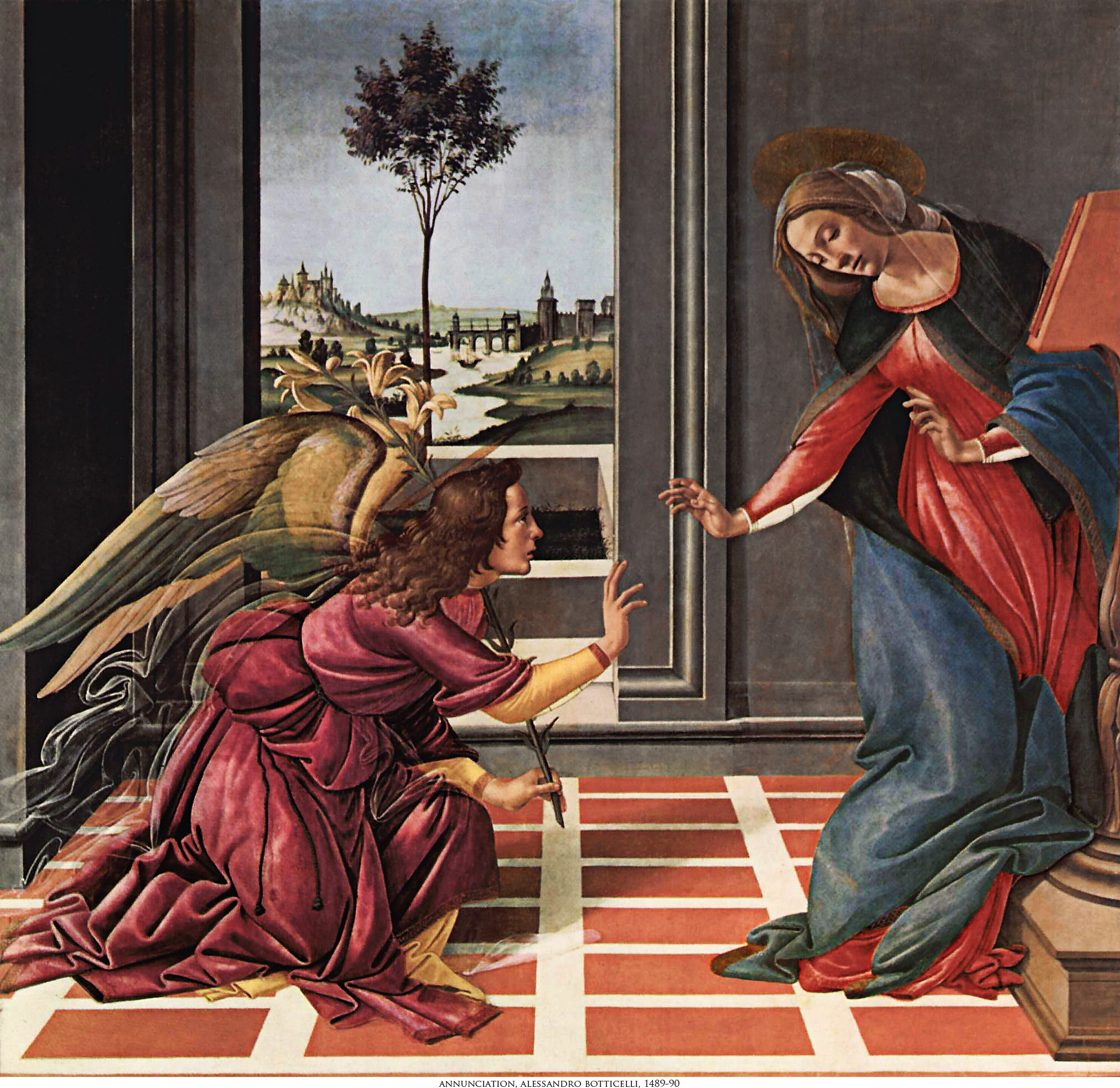
Fig. 3-6: Annuciation, Sandro Botticelli, 1489-1490 [Wikipedia entry]
I include the following curious, almost bizarre, image simply because it's a Botticelli and the public domain reproduction has enough detail to work with. I had exactly the same difficulty with colours as with the Annunciation:
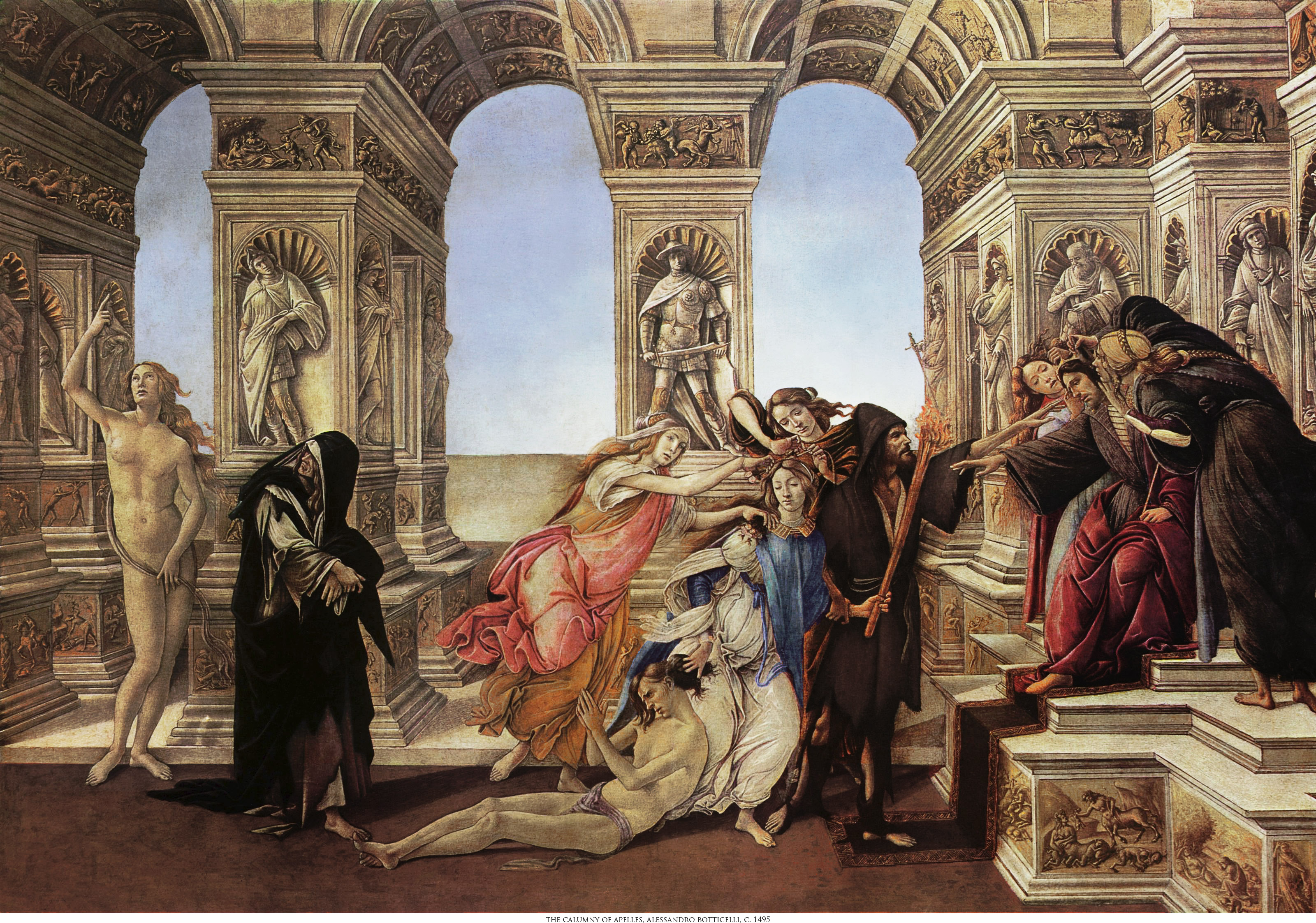
Fig. 3-7: Calumny of Apelles, Sandro Botticelli, circa 1495 [Wikipedia entry]
You can read the story line in the Wikipedia entry for Calumny of Apelles. Whether Botticelli had occasion to identify with Apelles at the time I can't say. However, to my eye the picture is unfinished, as if he tired of working on it long before it was done. We see from his other paintings that he was wont to use an alabaster skin colour for idealized women, but most of the people in Calumny are as pale as the stone sculptures that surround them. The leftmost figure of Naked Truth might well be mistaken for a sculpture except for the lack of a pedestal and the blonde colouring of the hair. Notice the next, black-robed figure. Until I read the Wikipedia entry I took this for a male conspirator and was struck by the likeness to the Evil Emperor of Star Wars.
Finally, here's another religious themed painting. In this case the reproduction colours needed only a little tweaking:
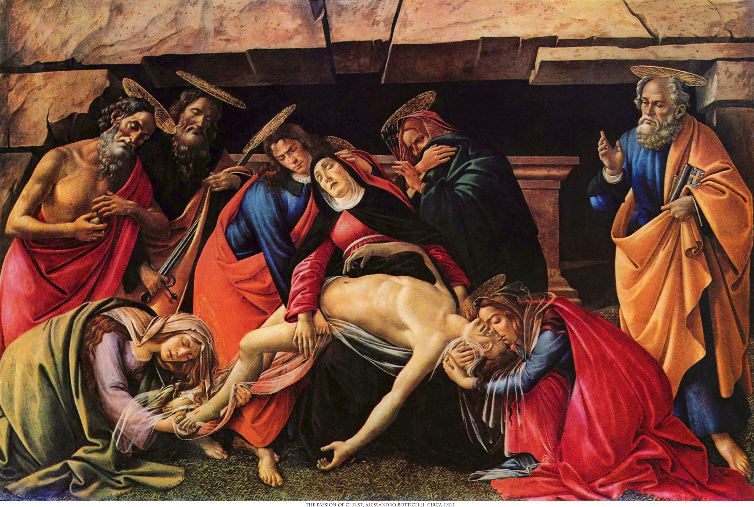
Fig. 3-8: Passion of Christ, Sandro Botticelli, circa 1500