The Art of Seeing Art
Version 1.1, © 2007 by Dale Cotton, all rights reserved.
Part 5: Framing & Composition
The architect has certain fundamental principles for designing a building. A mechanical engineer has certain fundamental principles for designing a machine. Similarly, the visual artist has a powerful toolbox for building a picture. Part of appreciating art is recognizing what tools are in the artist's box and knowing a bit about how they work.

Fig. 1: 180-05a
Tool 1: framing
Fig. 1 shows a scene in Sainte-Anne-de-Beaupré, Quebec, near the St Lawrence Seaway. This scene is filled with dull light, dull colours and is almost brutally simple; but it will at least serve to illustrate the points I want to make (I would have preferred not to use one of my own pictures, but was unable to find an appropriate composition without copyright restrictions). If you had been standing beside me when I took this photo, you would have seen a neigbouring yard to the left, a farm house to the right, more sky above, etc. In other words, Fig. 1 shows only a fraction of the entire vista that was before me.
Sainte-Anne-de-Beaupré is a potential tourist destination, and if a non-artist tourist had stopped at the same location with her camera, she might conceivably have taken a picture there. Similarly, if a painter with portable easel and paintbox had passed that way, she might also have set up to sketch or paint there. The chances of either of them choosing the same rectangular segment of the scene that I chose is very small. Either might have filled her frame entirely with the barn, or even just part of the barn.
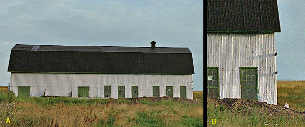
Fig. 2: 180-05, alternate framings
The non-artist is more likely to take a picture of the barn. The artist is more likely to make a picture with a barn in it. The barn was constructed in what I presume is a French or native-Quebec architectural style that few North Americans will have seen. That would be its attraction to the casual tourist (Fig. 2A), while its somewhat dilapidated state of repair together with the less than clear blue sky would be arguments against it. In direct contrast, an artist would see the barn as a source of rich textures and emotional connotations, but would then have to decide whether to make those qualities the subject of the picture (Fig. 2B) or widen her view to take in the surroundings (Fig. 1).
Tool 2: composition
Putting a road, path, or river in a picture is a common compositional device in representational art. It beckons the viewer "into" the picture, encouraging her to take part in the little world within the frame, rather than to remain standing outside it. In "reality" the stretch of gravel drive in Fig. 1 is a long s-curve, perhaps twenty feet wide by two hundred feet long. We "know" that it is twenty feet wide at the bottom right of the picture and twenty feet wide at the middle of the picture where it disappears from view. But what is actually there in the picture is a vaguely triangular splotch of dark greys that might be several inches on a side, depending on the dimensions of the picture.
As I mentioned in Part 3 the non-artist tends to look through a representational picture to be taken in by the illusion of visual "reality" it suggests. But the success of the picture has at least as much to do with how the artist arranges areas of colour on a simple flat rectangular surface. Some arrangements are weak and some are strong; some are energetic and some are lethargic; some are pleasing and some are jarring. The art of arranging areas of colour is called composition or design; and you can read more about it here.
The essence, however, is that the artist has to think of the 2-dimensional rectangle of a picture as a structure in the same way that the engineer thinks of a new bridge or pickup truck as a structure. For the artist the two most essential ingredients are structural integrity and structural energy.
To give you a rough idea, let's look again at the scene in Fig. 1. One tool for achieving structural integrity is the use of what I call visual rhymes or echoes, in which a given shape and/or colour is repeated elsewhere, tying those areas of the picture together. The barn roof and driveway interact due to their both having definite shapes and dark grey colour. The barn siding and the light patch in the sky to the right interact due to their off-white colour. The rest of sky and the field divide the rest of the image area in mirrored halves (A and B):
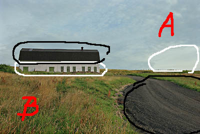
Fig. 3: 180-05, visual rhymes
The other critical element of composition is energy. Since your eyes cannot take in everything that goes on in a picture all at once, there tends to be one or more paths your attention will take when examining a picture. Here are the paths my eye takes:
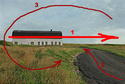
Fig. 4: 180-05, flow of attention
I've marked Path 1 as strongest because the barn and the horizon line catch my eye before anything else. (There may well be variation between individuals, so you may find that your own attention follows a somewhat different set of paths.)
You may have noticed that in art and professional photography the subject of the picture is rarely centered in the frame. One reason for this can be seen by comparing Fig.4 with Fig 2A. A centered object just sits there like the proverbial lump; but an off-centre object acquires visual energy from the imbalance it introduces into the composition.
One of the most useful things you can do when viewing representational art is to ignore the illusion of depth and instead look at the picture as the two-dimensional rectangle it actually is. Take a moment to notice how the artist has arranged shapes, colours, and textures within that rectangle.
* * *
Next week we'll look at two more tools in the artist's bag of tricks: colour and contrast.