Colour 102: Coping with colour casts
Page 3 of 3. Version 1.1, ©2012 by Dale Cotton, all rights reserved.
Learning to correct colour casts, continued
Example 2
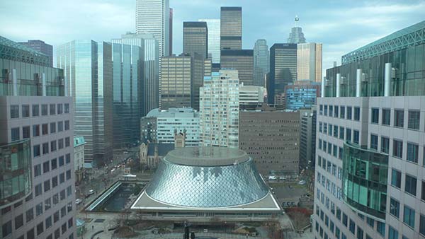
It's worth noting that Photoshop has another tool that can handle certain double casts with ease. Fig. 12 shows the view from an office tower in downtown Toronto. (The strange inverted cake tin building is called Roy Thompson Hall.) The window this picture was taked through has a greenish turquoise tint that affects the entire picture. If you look a the building on the far right, the protruding curved section of windows shows the glass tint very clearly, since the exact same glass has been used in both buildings.
At this point I suggest you download the larger version of Fig. 12, then use the Levels or Curves tool to try to remove the glass tint before reading further.
If you did that, your thought process may have been that the opposite of green is magenta, but removing magenta didn't improve matters. Since turquoise is a shade of blue-green and cyan is too, you may have found that bumping up the red caused a significant improvement, plus a bit of reduction to blue helped a bit as well. But unless you had better luck than I did, you didn't find anything that really clicked. So instead, go back to the uncorrected version then open the Hue/Saturation dialogue in Photoshop. The Hue slider changes all colours in a picture by shifting them left for cooler or right for warmer.
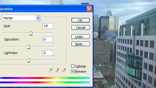
Fig. 13: using Photoshop's Hue/Saturation tool
Since blue and green are cool colours, moving the hue slider right increasingly warms the picture, and amazingly there is a point on the right, as we see in Fig. 13, that very nicely neutralzes the glass tint. So the upshot is when you're having trouble neutralizing a cast with Levels and Curves, give Hue/Sat. a try. Every so often it's the perfect tool for the job:

Fig. 14: Hue/sat. result
* * *
This picture is quite typical in that we need to decide upon a strategy for determing what cues to use to indicate when we've achieved a neutral image, as we did in the previous example by opting to concentrate on the white or near-white of the door on the left in Fig. 7. Even in Fig. 14 the walls of the close buildings on left and right have a magenta cast to them. Unless we're intimately familiar with this area, we can't know whether that's the actual colour of the concrete used in these buildings in that light or not. What we can know is that the sky colour looked wrong in Fig. 12 and looks believable in Fig. 14. That, plus the fact that Fig. 14 as a whole now looks neutral, or at least doesn't raise any red flags (or should I say turquoise flags?) to our eyes, is likely all the certainty we're going to get.
Sky colours, like skin colours, are one of those few universal constants we spend our whole lives learning about in endless varieties of lighting conditions. It's this subconscious expertise that instantly tells us the first time we visit Los Angeles (and many another smog-laden megapolis) at night that purple-maroon as a sky colour is just wrong... ;)
Example 3
For more of a challenge, here's the camera's JPEG of a random grab-shot of a Toronto street:
Click on Fig. 15 and Fig. 16 for larger versions, then right click to download if you want to follow along.
So what's with the camera JPEG? Are these people victims of a drive-by orange skin paint attack? This is a fairly recent Olympus model and Olympus has a sterling rep for "pleasing" colour. The meta data even says I shot with a custom white balance.
Fortunately, I happen to have the raw for this shot, and a few tweaks to it from the default settings to match contrast, together with the application of a custom daylight profile for this individual camera gives the following result:
We've concentrated on colour casts so far, but the first thing you want to check when dealing with a JPEG is actually over-saturation. I keep the JPEG settings on my cameras at conservative values, but even then it's hard to get an out-of-camera JPEG without over-saturation of at least the warm colours (red-yellow-orange). This in spite the havoc this plays with skin colours as we see in Fig. 15. To compensate for this I opened the Hue/Saturation tool but this time used the second slider because I wanted to reduce saturation. I could have attempted to work with just the oranges, but the result I got by using the master slider was just what I wanted, as we see in Fig. 17 and Fig. 18.
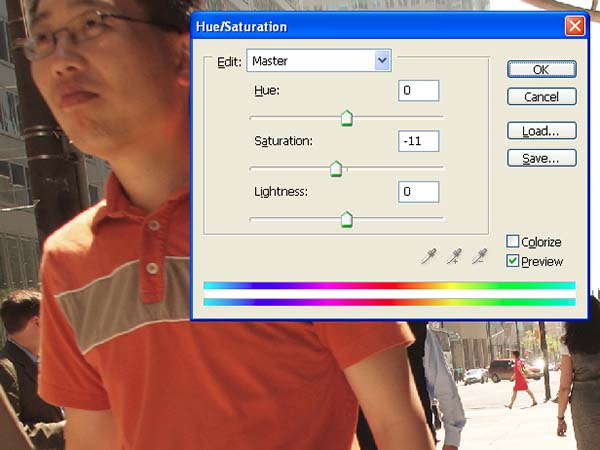
Fig. 17: using Photoshops Hue/Saturation tool

Fig. 18: desaturation result
That's a great start, but if we want to match the raw colours more closely we have more work to do. It's hard to know what the colours of the surrounds should be, but as previously mentioned, skin colours are something we're all intimately familiar with and therefore more critical of. The difference in skin colours between Fig. 18 and Fig. 16, however, once again takes us into double cast territory. The blue channel is higher in Fig, 15, adding blue to the skin tones, while the green channel is down, adding magenta. This prevalence of double casts (and we haven't even had to deal with multi-point casts) is the sort of thing that can drive a person crazy and is why you don't want to be doing this for a living...
So if we match Fig. 18 for skin colour by adding green and subtracting blue in Levels or (single point) Curves we get:
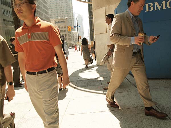
Fig. 19: double cast compensation using Levels
Now the skin tones are very much in the correct ballpark – but look what's happened to the BMO (Bank of Montreal) blue panel on the right. Levels and even multi-point curves are not the right tools if you want to handle a problem as complex as this. Instead, we need to break out Photoshop's Replace Color dialogue, use the eye dropper to build up a selection of the various skin tones in the picture (and the orange-rust shirt also comes along for the ride), then bump the Hue slider over to the right:
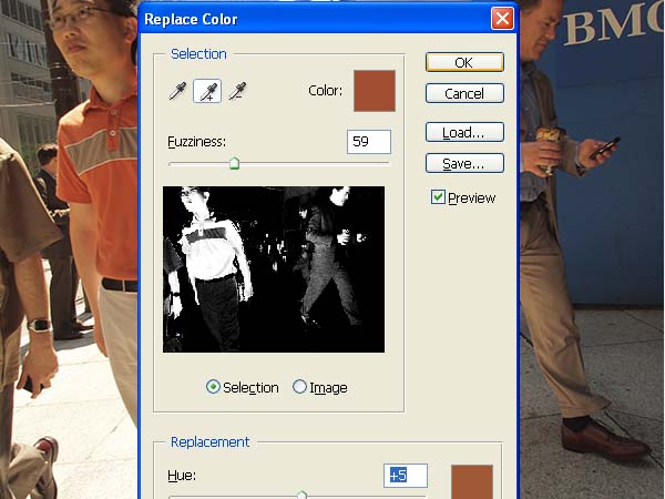
Fig. 20: using Replace Color to tweak only skin colours
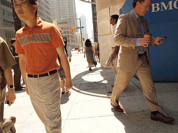
Fig. 21: results of Replace Color
Now that the skin colours are fairly well matched we could use Replace Color again to tweak the beiges of sidewalk, clothing, etc. Then yet again to match the BMO and street sign dark blue.
* * *
Well, that's all folks. You're on your own from here unless I get around to some real masochism one day and do a Colour Casts 102 tutorial on the joys of correcting film scans.
Oh yes: you're probably wondering how close you came to getting the drill in Fig. 3 on the first page correct. The solution is here.
