Colour 101
Part 3: Capturing the Light
Version 1.1 (Jan. 2010), ©2010 by Dale Cotton, all rights reserved.
A bit of history
Colour photography became a practical process in 1936 with Kodak's release of Kodachrome slide film. From the beginning there has been a tension between accurate and pleasing representations. While Kodachrome was hardly the final word in colour accuracy, it was up-staged by Velvia which photographers switched to in droves because of its more pleasing colour reproduction, pleasing in this case being equivalent to increased saturation.
By the time digital photography became a commercial force, camera manufacturers were already well aware that their job was to produce cameras which generated sellable colour, not accurate colour. The rudiments of the formula were well-known from the film photography wars: saturation and contrast = sales. The trick was to find the optimal balance between the contradictory requirements of augmented saturation plus contrast to please amateur and landscape photographers, versus realistic skin tones to please portrait and wedding photographers, versus fully accurate colour to please product photographers. The initial solution was to attempt to achieve accurate colour output from the ultra-expensive digital cameras sold to professionals while gearing the output of lower-end cameras to the punchy saturation+contrast tastes of the Mom and Pop masses.
Neither task was enviable. On the accuracy side, the difference between fashion designer Alberto's Passion Pink and fashion designer Bettina's Pleasure-Me Pink could well be one or two parts per thousand of redness. On the pleasing side, people acccepted nearly any amount of over-saturation ... so long as it didn't apply to skin colours. High contrast was good ... so long as it didn't turn blue skies white or turn dark shadows black.
Digital capture

Fig. 20-A through 20-H: Sunny summer scene (Pentax K20D)
For Fig. 20-A, I raw-developed a very accurate rendition in both colour and contrast, as seen on the first button. This is extremely close to the colours you would have seen had you been standing there with me taking the picture. 21B is unedited from the camera with settings of auto white balance plus contrast and saturation set to neutral. 21-B is surprisingly accurate; the primary difference between it and 21-A is the cooler colour temperature: the auto white balance did not quite nail the compensation needed to fully neutralize this scene. The resulting slight blue cast (21-B) would have disappeared had I done a custom white balance off a white balance target. 21-C (vivid 1) takes you to a JPEG created with both saturation and contrast pumped up one notch in the camera's settings menu. 21-D the same, except two notches each. I'll leave to you to decide if either approximates a Velvia or Kodachrome rendition. Show these four versions of the full scene to one hundred randomly selected people and a significant majority will gravitate to one of the two vivid versions. The increased saturation and contrast does to eye appeal the same thing that fat, salt, and sugar do for junk food sales.
The next four buttons zoom in on just the people in the boat. While the increase in saturation adds grab to the overall image, it has just the opposite effect on skin tones. Looking at 21-H, we can only guess that the man standing at the back had been wearing orange body paint the night before and wasn't able to fully clean it off before the excursion. The two women in the front of the boat are unfortunately afflicted with jaundice. There is very little latitude available for increased saturation in the red-orange hues so long as skin colours have to be taken into consideration; hence the reputation of Fujifilm slide stock as having vivid greens and blues but not warm hues. Any portrait studio photographer will tell you that most Caucasian males will be perfectly happy with the skin tones in 21G, but most Caucasian females – while never happy with any version of skin tones, accurate or no – will be least unhappy with 21E.

Fig. 20-I: Mass-market ideal version
For 20-I I started with the 20-A (but could have used a custom white balanced JPEG from this camera), cranked up the contrast with an S-curve in Photoshop, then cranked up the saturation about half way between the cameras first and second notches on all but the orange hues (the part of the spectrum into which flesh tones fall). These steps could be easily automated with a Photoshop action. If you repeat the experiment of showing versions 20-A through 20-D to one hundred people, but this time add 20-I, I'm pretty confident 20-I would be the winner by a landslide.
Colour spaces
But beyond all that, no amount of technical success with a camera is of any value whatsoever unless the end-user is able to see the results. A photo captured by a digital camera is first seen on the camera's LCD panel – that much camera makers could control. But beyond that it might be seen on any one of a million different computer monitors or printed on any one of a million different printers. If any one of these monitors or printers has even a one percent bias in its colour output, the results are about as pleasing as a mere one percent skunk in the smell of a new perfume. Fortunately, this problem pre-dates digital photography and has already been addressed in the television industry by the creation of the sRGB colour standard. The key to sRGB is to throw 65% the colours that the human visual system can see and retain the 35% that all sRGB devices could reproduce. Fortunately, that 35% includes nearly all colours found in nature (with the occasional Neon Tetra and particularly spectacular sunset numbering among the casualties).
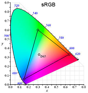
Fig. 21: Three gamuts (inside triangle)
The sRGB diagram in Fig. 21 above attempts to show the colours contained in the sRGB colour space inside the triangle as compared to the colours excluded by sRGB. Two problems: one: the diagram shows only a two dimensional slice through the full three dimensional reality of colours. Essentially, we're seeing hue and saturation but not luminance. Two: unless you're viewing this page on a very rare and pricey monitor, you're viewing the diagram using an sRGB device, which throws away all colours outside the triangle, replacing them with colours at the edge of the triangle. While this is obviously a problem, no device exists which can display all the colours outside the triangle.
In theory, a digital camera can capture all colours; in practice we're unlikely to see for ourselves whether that's true or not, since no full-gamut output device exists or is on the drawing boards. As I write this, some very expensive monitors are on the market which can display significantly more than sRGB, namely the Adobe RGB gamut (second button of Fig. 21).
Similarly, high-end printers are pushing limits beyond sRGB, although not in such a way as to tidily fit into a workspace gamut like Adobe RGB or ProPhoto RGB. For this reason, serious photographers who work with such monitors and printers have largely switched to working in ProPhoto, which is large enough to contain current printer ink gamuts and those likely to come in the foreseeable future (using ProPhoto requires a full 16-bit workflow, which means the JPEG image file format is useless).
Note: sRGB remains the correct colour space for all images destined for general monitor viewing or commercial lab printing or normal home inkjet printing.
Colour spaces are just the tip of the iceberg that is colour management, a full discussion of which is beyond the scope of this tutorial, but see Martin Evening's excellent coverage here.
Colour compared
Before digital, photographers would choose a film stock based either on how pleasing or how accurate the photographer felt its colours were. Now, many photographers place great store in the colour-handling of a particular brand and even model of camera. This is a pecularily JPEG-centric concept.
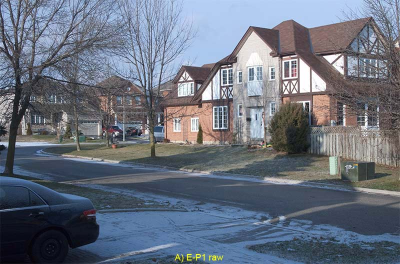
Fig. 22: Morning daylight colour interpretations from three cameras
Fig. 22 shows the difference in colour interpretation of three different digital cameras I happen to own that have raw capability: the Olympus E-P1, the Pentax K20D, and the Panasonic LX1. I shot the same scene using both auto white balance (AWB) and custom white (CWB) balance. I set custom white balance using a spectrally neutral grey target held in the sunlight. The JPEG settings for the AWB and CWB shots were the most neutral available: no added saturation or contrast. The JPEG vivid shots were done using AWB plus a middle saturation and contrast increase (the vivid version for the LX1 is missing because I made a mistake in using the menus – no great loss). I also shot a GretagMacbeth/x-rite Color Checker card in the same light, then created a custom profile for that light for each camera, then developed the raw using that profile plus the most neutral settings in Lightroom.
The differences between raw shots – the most accurate colour I can obtain from each – from the three cameras is real but minimal. The LX1 raw seems the odd ball out; but the difference is mainly one of contrast, not hue. The E-P1 seems to be trying to do us a favour by dramatically warming the AWB shot; but this is simply the result of the auto white balance latching on to the shadows instead of the highlights. Not one of these interpretations is particularly pleasing. In this cool morning light, accurate colour is far from appetizing; and of the in-camera AWB results, only the LX1 happens to hit on something at all palatable.
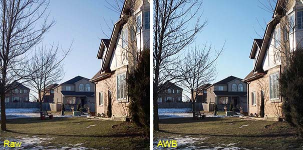
Fig. 23: Sky blues compared: profiled raw vs. AWB
A serious problem with the in-camera JPEG engines of every digital camera I've ever used can be seen in Fig. 23. Quite frequently, a certain shade of pure sky blue becomes a sickening shade of aqua (green hue shift).
The differences between raw shots – the most accurate colour I can obtain from each – from the three cameras is real but minimal. Even using custom white balance, the JPEG engines in all three cameras turns the sky from blue to varying degrees of aqua. In each case the auto white balance shots differ from the custom white balance shots simply in how close the accurate the auto white balance mechanism of each camera happened to be in this particular light. The vivid JPEGs have no particular relation to reality and trying to rate them for "pleasingness" is an exercise in futility.
What we can say is that the auto white balance and JPEG engines in some cameras brutalize reality a little less than those in other cameras, and that once we move into the realm of pumped-up saturation and contrast it becomes a matter of whether you prefer Coke or Pepsi.
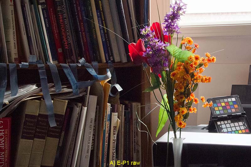
Fig. 24: Indoor window light colour interpretations from three cameras
Now let's move indoors. Because the scene in Fig. 24 is right beside my monitor, I can compare the results of each image to the "reality" of what my own eyes see. All three profiled raw shots are very nearly identical and are nearly perfect matches to the original scene. The only problem with the raw versions is that none of them quite nails the blue of the strips of Epson packing tape dangling from the shelving. The K20D raw is closest, but the truth is somewhere between it and the LX1 version; the E-P1 version has too much red in the blue tape strips. The in-camera JPEGs are all over the map. Apparently, this is a very tricky scene, since even the custom white balance versions are disappointing: the E-P1 decided to juice up the scene with saturation, while the K20D and LX1 both thought de-saturating was the only safe way to go. And any painter that chose the AWB colours from the E-P1 or LX1 over the raw or CWB versions would be sent for an eye exam.
Colour nailed
The gadget with the coloured squares lower left in Fig. 24 above is the x-rite colorchecker Passport. This marries the long-standard GretagMacbeth Color Checker reference card with a white balance target (on the mostly-hidden third leaf), plus a new warm/cool white balance target (top leaf in Fig. 24). Having used it now for over a month as I write this, I'm beginning to get a feel for what it brings to the table. Particularly if you're shooting JPEG, taking an accurate white balance reading is an extremely important antidote to the never-quite-right guesses any in-camera AWB engine is heir to, as we've already seen. The colour swatches on all three leaves of the Passport are spectrally balanced, not just neutral to the eye.
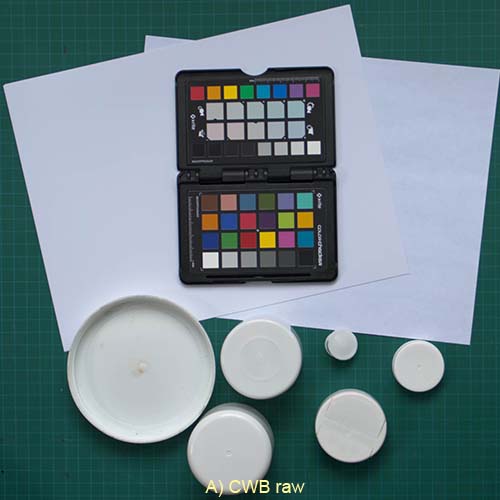
Fig. 25: a variety of potential white balance targets
The four versions of Fig. 25 are all generated from a single exposure for which I first did a custom white balance off the Passport. 25A was developed in Lightroom (Beta 3), using the custom WB, the supplied Adobe Standard profile for the camera I used (Pentax K20D), and otherwise all-neutral settings. 25B is the in-camera JPEG output for that shot. 26C is developed the same way as 25A, except the white balance was taken off the sheet of white bond paper in the scene. Similarly, 25D was balanced off the cap from a can of PremierArt Print Shield spray.
My intention in performing this little experiment was to graphically demonstrate that the common practice of taking white balance readings off some common household item the photographer guesses to be neutral would lead to shame and disaster. In fact, the Print Shield cap gives a WB reading well within the limits of error for the Passport target. The cap is not matte-finished and of course not spectrally neutral, so all sorts of insidious problems can be expected to crop up from time to time. Nevertheless, it demonstrates that an inexpensive substitute for a legitimate white balance target may well serve for casual use. The trick is to find the best object. For those in North America the top from a can of Pringles chips is widely reputed to be just such a treasure. (Actually, I have two cans of Print Shield spray and only the older one is a really accurate white; whether a change in style or in sub-contractors, the same thing could easily happen to Pringles, if it hasn't already.)
I referred to the limits of error above because a very practical enigma that arises when using the Passport colorchecker or the GretagMacbeth card. The bottom row of both cards contains six neutral swatches from white to near-black. In theory, using the eye-dropper tool off the second or third swatch in most any raw developer should give a perfectly good white balance reading. What in fact happens is that if you click in ten different places in a grey square you get ten slightly different readings, such as 4200K, tint -6 or 4315K, tint +2. There is no method short of flipping a coin for choosing one over another. This is why it's presumably better to do a custom white balance off the full white balance target using the camera, since the camera will hopefully average a broad area of the target, instead of working off a few pixels. In general, it's mainly product/catalogue photographers that need to worry about this degree of white balance accuracy; for the rest of us, it's just one of those puzzling things.
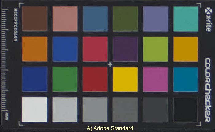
Fig. 26: Adobe Lightroom profile vs. Passport custom profile
Another use for the colorchecker card is to generate custom camera profiles to use in your raw development app instead of the generic profile for that model camera supplied within the app. This relates to a common complaint among those who shoot raw that their favourite raw developer app outputs less than ideal colours compared to those from another app (with a detestable interface) or compared to the colours of in-camera JPEGs, (I've yet to run across a raw developer with a camera profile as bad as any in-camera JPEG engine I've ever seen, but of course some people put ketchup on filet mignon, so it's all a matter of taste.) What we see from Fig. 26 is that the Adobe Standard profile for this particular camera (K20D) looks reasonably accurate. But when we compare it to the custom profile generated from the Passport portion of Fig. 25, we see that all colours with any significant blue component differ. I don't have a $20,000 colorimeter to verify, but my eyes tell me the custom profile is smack-on. There are other, minor differences, as well.
Again, these are distinctions that may only concern you if you're doing product catalogue work. If you desperately need to replace the default profile in your favourite raw app, the Passport or any GretagMacbeth color card may be the solution, but understand that the Passport software generates DNG profiles, not ICC, which limits its use to Adobe products at this time.
Upshot
In spite the fanatical convictions of on-line photographers, the above investigation suggests there is no such thing as a digital camera with "good" or "pleasing" colour, since there is no one distortion of reality that works across all possible scenarios. What the better cameras do is provide more accurate in-camera colour profiles and white balance detection algorithms – along with a suite of options to allow users to distort reality in a variety of ways. However, the biggest weakness in in-camera processing remains white balance. Choosing from white balance presets, such as Sunny and Shade, almost guarantees a colour cast, yet replying on in-camera auto white balance delivers neither consistently accurate nor pleasing results.
The royal road to pleasing colour is to capture as accurately as possible, ignore in-camera distortions, then modify the results to taste using the far more subtle tools available in post-processing.
Further reading
Here are two Wikipedia articles of interest: Colors and Color Management.
Andrew Rodney: Role of Working Spaces and his web site Digital Dog.
Martin Evening: Chapter 13: Color Management from Adobe Photoshop CS2 for Photographers (thanks to Richard Flake for pointing me to this valuable resource).
Ian Lyons has several practical tutorials on colour management as feature articles on his site, The Computer Darkroom.