Composition in the Field
For the Art Photographer
Page 8. Version 1.1, Page 1, ©2001 by Dale Cotton, all rights reserved.
Cropping in the Field (continued)

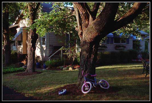
Figure 11. 68-13
Here we have a similar but smaller problem. Passing this scene, my eye was taken by the variety of shapes and colours, that nevertheless hung together. I knew I wanted the bike, the helmet, and at least part of the house/cottage behind them. Stepping farther back, I could easily see that elements on all sides of Figure 11's crop were distracting, including the drive way on the left and the house on the right. Stepping closer, I was equally unimpressed with what the change in perspective did between the bike, tree and house. That primarily left changes in position and focal length. 68-13 happens to be the only shot I took, but even it is a compromise dictated by the 2:3 aspect ratio of the film format. I didn't want this exact crop, but I deferred the decision on a final crop by including everything of interest to left and to right. On reflection, it turns out, I like it best exactly as it is, truncated bench and all. (Which just goes to illustrate my earlier point about the importance of keeping track of your original position when the scene first catches your eye.)
Note: It seems I have more than one axe to grind regarding this mild form of insanity we call art photography. Both the above scenes bring one such to mind. There is a certain lah-de-dah school of landscape photography in which the inclusion of any creation of mankind – especially high tech – is anathema. What we're doing here is lines, masses, and colours – right? Sometimes the telephone wires or fence post actually adds to the scene. I try to draw the line at anything that resembles a real estate or automobile advert. Hopefully, we can add a little tolerance to the mix and all learn to get along ;)