Post-Processing tips for sub-optimal RAW images
Page 2, version 1.3, © 2008, 2009 by Dale Cotton, all rights reserved.
Sharpening
Note: Your monitor will have a dramatic effect on how sharpening appears on-screen. I am using a 19" CRT at 1600x1200 res., which means each pixel is extremely tiny. LCDs in general, and larger pixel size LCDs in particular, may give a very different perception of acutance. If so, you may need to train your eye over time to compensate for the difference between what you see on-screen and what you see in the resulting print.

Fig. 9: A portion of the as yet unsharpened image
One reason we applied zero sharpening in the raw converter was to not interfere with Noise Ninja's work. We can see from Fig. 6 that the ultra-fine resolution of the K20D means we will need very little USM (except, perhaps, in the corners ;) to achieve realistic acutance (edge crispness). What we don't want to do is either to introduce halos or to obliterate fine detail.
Bruce Fraser, the imaging guru, was instrumental in establishing a three-prong approach to USM: a first USM pass, called capture sharpening, is applied during raw conversion, to undo the softening of the anti-aliasing filter and other in-camera losses. Then in Photoshop or other image editor a second pass, called creative sharpening, is performed that benefits any form of output. Finally, a third-pass, called output sharpening, is specific to different uses of the image file, whether small print, large print, or on-line. We'll borrow portions of this.
Many people use USM without understanding how it works or exactly what Radius, Amount, and Threshold actually refer to. If that describes you, you may want to give Understanding the Unsharp Mask a quick read.
All USM is destructive; more than the minimum required is unnecessarily destructive. Lightroom's USM module only goes down to 0.5 radius, which I'm finding is still too blunt a tool for the detail I'm seeing from modern cameras. Let's see if you agree:
Save Fig. 6 to your hard drive, open it in Photoshop, make a couple duplicates, then apply USM with various radius settings in Photoshop at 100% magnification or larger to one of the copies. Don't bother with threshold. First try Radius = 0.1. Even at Amount = 500 there's no appreciable effect. Next try Radius = 0.2. Thanks to the extremely fine branches against the sky, we can see edge blur diminishing nicely at Amount = 500 and with no haloing. Now apply a second pass at Radius = 0.2 and Amount = 500; some haloing appears around the very thinnest branches, meaning we've gone too far in those areas, so back off until all haloing just disappears. For me, that's around Amount = 100. We've applied a total of Amount = 600 at Radius = 0.2.
With another copy of Fig. 6 beside the first, experiment with Radius = 0.3. I find Amount = 145 or 150 is about where haloing starts. With yet another copy try Radius = 0.4. I find Amount = 100 is where haloing starts. Examine the three copies next to each other to see whether you agree that the finest branches look every so slightly crisper at Radius = 0.2. Of course, if you disagree then you'll want to use the radius that does look best to you.
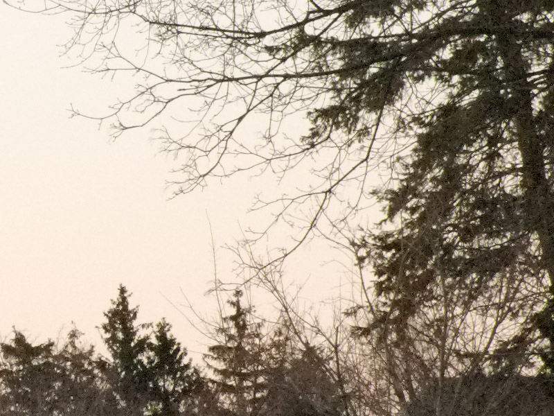
Fig. 10: USM, Amount = 600 at Radius = 0.2
Note: Camera/lens combinations with less resolution will have proportionately less fineness of detail and so will need a proportionately larger radius in USM. Radius = 0.3 may be perfectly suitable for a 10 mp camera and good lens, for example.
Finally, go back to the full scale image, duplicate the background layer, rename it to Minimal USM or similar, then apply the small-radius USM you settled on above, whether Radius = 0.2 or something else. Use whatever Amount you are comfortable with up to the Amount you found as being the maximum before haloing sets in (Amount = 600 in the above example). It should look pretty good by now, but areas other than the finest branches may still benefit from a bit of crispening. Try a wider radius but smaller amount of USM, such as Amount = 50 at Radius = 0.5. This will probably halo the finest branches and perhaps other areas, so examine the whole image critically at 100% mag. and use the History Brush to undo as and where needed. Anything that should be soft due to DOF blurring may also need some undoing.
One thing to bear in mind is that you're viewing the image on a monitor, which is roughly a 100 ppi device, and which therefore gives you a much coarser view of the image than a typical 180 to 360 ppi print would. It takes some practice to separate the amount of softness in what you seen on-screen that's due to the coarseness of the monitor and the amount that would remain if printed. A useful exercise is to print an image with zero USM, then again with increasing levels of USM, to get a feel for what an image that is properly sharpened for printing looks like on-screen.
We've actually done two or three different applications of USM. Once applied to just the problem areas (corners); once applied at an extremely small radius to the entire image but undoing where necessary, and optionally once at a slightly wider radius but low amount. If you take away nothing else from all this, let it be that the amount and radius of USM you apply needs to vary from one part of the image to another. There is no one USM setting that will optimally sharpen every part of every image.
For me, the Minimal USM layer is appropriate for printing at relatively normal print sizes. If you need to print super-large, you might need to up-sample then apply more USM. If you need to create a web or e-mail version of the image, the amount of USM applied for the Minimal USM layer is pretty much irrelevant – you'll likely need to re-sharpen the down-sampled image.
Update, 2009: Since writing this, I've hit on a shortcut that should work for most dSLR output. Do a first pass of USM at 1.0 radius and a small threshold value, such as 2, with a conservative amount value to prevent halos. Next pass use the smallest radius, such as 0.2 or 0.3, you've settled on to touch up.
Parting thoughts
Everything in this tutorial has been directed at retaining the maximum goodness of the original image file and introducing as little trauma as possible while correcting some common problems. I'm not thereby trying to impose a particular aesthetic on anyone; if you're creating art and want to goose up contrast, saturation, acutance, graininess, or whatever, that's your call as an artist. Take whatever's useful and leave the rest behind.