Some Masterpieces from the Public Domain
Version 1.6, © 2009, 2015 by Dale Cotton, all rights reserved
Other Painters (Pre-1800)
Update, Mar 2015: multiple revisions to the Mona Lisa section.
Leonardo da Vinci
Wikipedia entry for Leonardo da Vinci
Leonardo lived in Italy from 1452 to 1519; more than that it would be pointless repeat, given his fame.
There are good-sized scans available on the above Wikipedia page of some of his most famous images, including The Last Supper and Mona Lisa. That the young woman in Fig. 8-2a was a certain (ma donna or m'lady) Lisa Gherardini, wife of wealthy merchant Francesco del Giocondo is apparently no longer a matter for debate. While the merchant commissioned the painting, he never received it: Leonardo is known to have had it in his possession the rest of his life. This might partly have been due to the number of years he reportedly spent working on it and partly because he treasured it, just as Vermeer was later to treasure his The Art of Painting. (My own guess is that Francesco and Lisa got a second painting from Leonardo's workshop; but that's mere supposition.) The reason this painting took so long to complete may have been due to the paint layering techniques, including sfumato and glazing, which Leonardo employed. Layering thin coats of paint requires drying time between each. Fig. 8-2a shows us the Mona Lisa as it currently exists. Whatever else history may say about the model Leonard posed for this painting, there is no indication she had advanced jaundice: that affliction is due to 500 years of linseed oil yellowing and who knows what pigment changes:

Fig. 8-2a: Mona Lisa (La Gioconda), Leonardo da Vinci, 1503-1517 (present-day colours)
Click on Fig. 8-2a to go to the Wikipedia Commons page; there you'll find the full scan file plus multiple attempts to derive the original colours by removing the yellowing. Simply canceling out the yellowing in Photoshop, so that something resembling normal Caucasian skin tones results, looks like this:
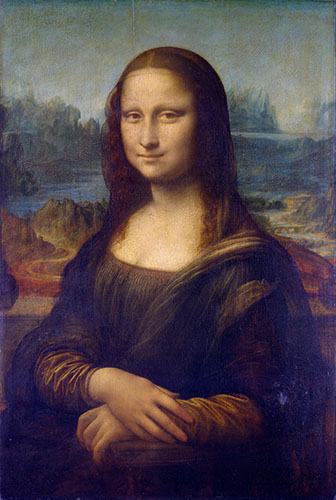
Fig. 8-2b: Present-day Mona Lisa with age-yellowing digitally removed
With even vaguely valid skin colour we see that the sky is now also a believable pale blue and green mix. The strange violet glare on the left and right, is an artifact due to reflections of the artificial lights on either side of the painting bouncing off the sheen of the oil paint.
Why a blue sky? The water in the landscape on the left is clearly blue, even in a simplistic digital restoration. We naively think of water as being blue, but of course water is like a mirror and is only blue when the sky is blue. This is the sort of natural phenomenon Leonardo would have been aware of; and it rules out other believable sky tones like overcast and sunset. So does the fairly strong contrast between light and shadow on the model, which implies a bright light source. If you need further convincing, check out Pascal Cotte's heroic efforts to determine the original colours of this painting using a multi-spectral camera of his own invention.

Fig. 8-3: Mona Lisa (La Gioconda), Leonardo da Vinci, 1503-1517 (restored, version 3)
Fig. 8-3 is my own restoration for my own print collection (as always, click on it to download the full-sized version). As usual, I've minimized the crazing without eliminating it. The colours are not so much an attempt to simulate what we'd see if the painting were physically restored (which would necessarily be a compromise dependent on the techniques employed) but more to simulate what the colours would have looked like during Leonardo's life time. The ideal, if you will, toward which a hypothetical physical restorer would aim. We have the basics of blue sky and Caucasian skin to go by. We know Leonardo favoured a subtle pallet over vivid colours. We know that, like any artist, he would have kept the background sufficiently muted as to not compete with the subject. Beyond those fundamentals, these colours are sheer guesswork on my part, informed by years of work as a visual artist but with no privileged pipeline to spirit of the painter. If they please you, fine; otherwise, the safe option is to live with the original/yellowed version.
According to Wikipedia, the good folk at the Louvre have eliminated much of the yellow cast without attempting a physical restoration. Instead, they've used an LED lamp with just the right amount of extra blue in its spectrum to neutralize the age-yellowing.
Note the left/right bands of colour in the background in Fig. 8-3. The sky is pure blue, the mountains blue-green, the land below the mountains is green to yellow-green, then closest to the window ledge are warm reddish tones that merge with the foreground. This purely traditional arrangement from coolest to warmest, which you would have heard passed on from master to apprentice in any workshop of that era, gives me another bit of comfort that my pallet is at least in the right ball park. Today we see this as red/green/blue – the additive primary colours.
The other great mystery about this painting is of course the smile. You can believe whatever theories you like about the smile being due to the model being pregnant and/or being Leonardo's mistress. The reality, however, is that posing for a painted portrait is nothing like posing for a photograph. This painting almost certainly took hundreds of hours over two or more years to complete. Leonard would likely have sketched in the outline very quickly at the beginning then referred to the model for colour and tone values thenceforth, feeling free to modify the outline as he went along. Through all that he may well have had a real smile from the model to work from for a few minutes. My own suspicion is that he worked from the naturally expressionless face any model presents when sitting for hours. Wanting a smile, he manufactured it by up-turning both the corners of the mouth and, more interestingly, of the eyes. The wing-like, up-turned shadows on the outside edge of each eye are a configuration I personally can't recall having seen in reality, but it certainly adds to the overall impression of enigma. And what about those plucked eyebrows? A fashion fad even then? One theory is that they were lost in one of the several restoration attempts over the centuries. Or Leonardo may have left them out or painted them out himself, if he was unable to find a compromise between the conflicting demands of those details and the sfumato rendering.
Along the same lines, there's long been a theory that the face in this painting was not Lisa Gherardini's, or any woman's, but Leonardo's own face. Apparently, this can be seen by comparing it to one of his self-portraits. I remember a certain exercise in high school art class. The teacher paired off all the students, having them draw a portrait, each of the other. It was almost comical that in nearly every case the the resulting sketch far more closely resembled the creator than the subject. But Leonardo was well beyond such beginner's difficulties.
Albrecht Altdorfer
Wikipedia entry for Albrecht Altdorfer
Albrecht Altdorfer lived from 1480 to 1538 in southern Germany. I've toned down the obviously false super-saturation of the Wikipedia Commons image file as much as I dared. This version is at least within the realm of possibility as to what oil-based pigments can do; but I'm certainly no historian so can't say how appropriate it is to the period:
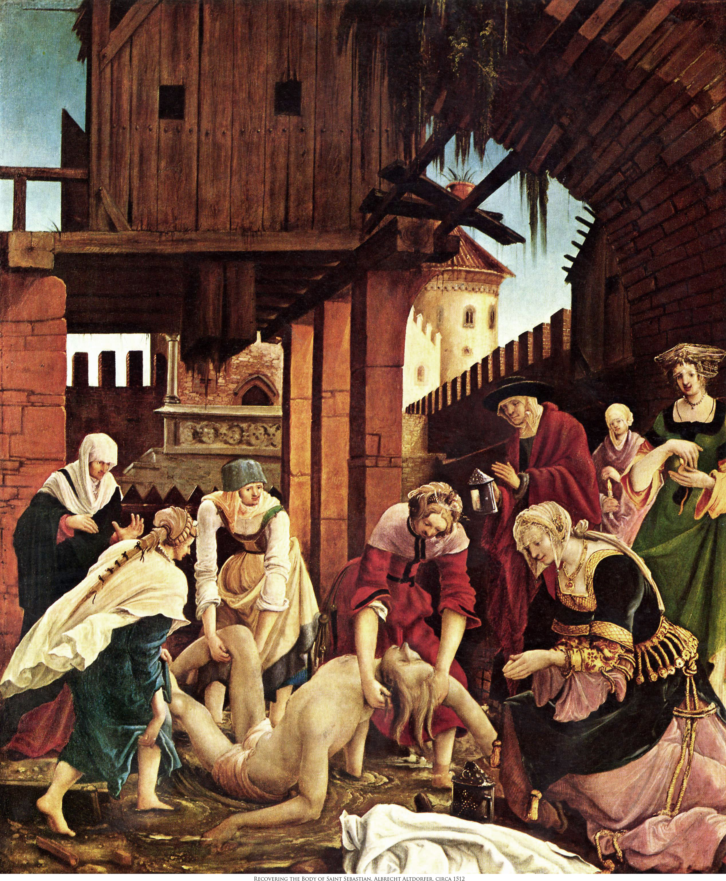
Fig. 8-1: Recovering the Body of San Sebastian, Albrecht Altdorfer, date unknown
Bernardino Luini
Wikipedia entry for Bernardino Luini
Wikipedia tells us Luini lived from appprox. 1480 to 1532 in northern Italy and was a student of Michelangelo. Historians seem to be in uncertain whether this painting was intended to represent the Old Testament Susanna or the New Testament Maria Magdalena. Either way it's a honey of a picture:
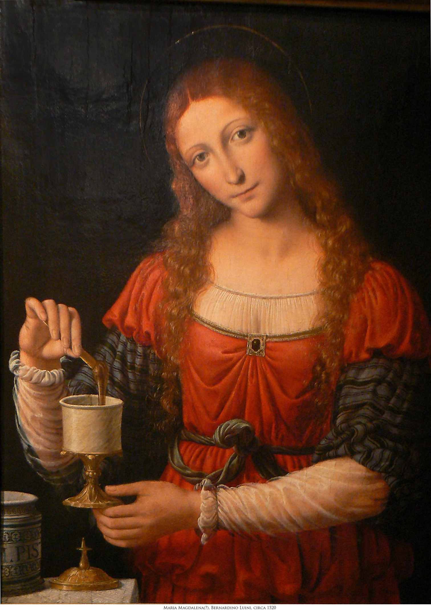
Fig. 8-4: Maria Magdalena, Bernardino Luini, circa 1515-1524
Michelangelo Caravaggio
Wikipedia entry for Caravaggio
In Caravaggio, a century after Altdorfer, we can see the astounding difference in realism that had grown in Europe. Caravaggio's two paintings below could easily be mistaken for photographs, and his choreography would due credit to a modern cinema director's.
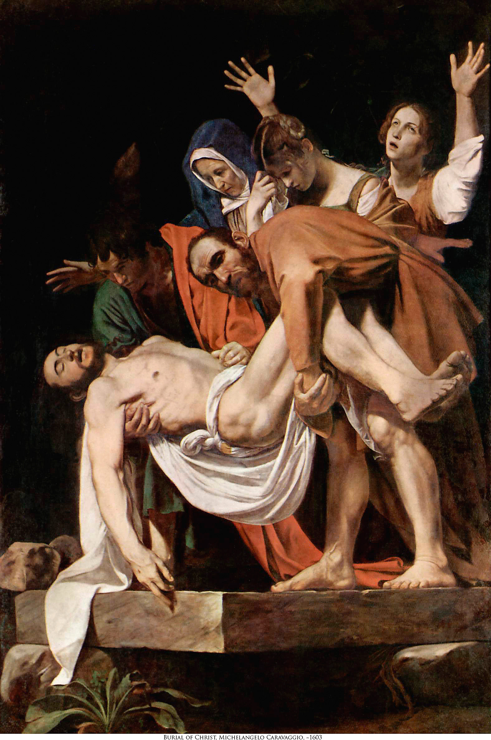
Fig. 8-5: Burial of Christ, Michelangelo Merisi da Caravaggio, 1602-04

Fig. 8-6: Birth of Christ with Hl. Lorenz and Hl. Franziskus, Michelangelo Merisi da Caravaggio, 1609
Peter Paul Rubens
Wikipedia entry for Rubens
There's a lot more of Ruben's huge output available on the web. This is the only one I've done so far. The scan file here seems pretty believable, so I didn't adjust the colours. I can't explain either the vertical or horizontal dark streaks in the sky, but they seem to be in the painting itself, so I left them alone.
The patchwork of little cameos scattered throughout this (very large) canvas, such as the cattle trapped over the falls, and the group of people on the right, is reminiscent of Breugel. To me this suggests Rubens was attempting to entertain his viewers in much the same way a wandering story-teller might dramatize a familiar tale for alms. This is the same approach to visual story-telling we'd see in a Biblically-themed canvas, but here done secularly, and therefore with no attempt at solemnity.
But what strikes me most about this picture is how strongly the colours and almost sketchy brushwork echo the Cezannes that were to follow. This is probably more an artifact of the reproduction than the painting itself, but since I haven't seen the painting in person, I can't rightly say.

Fig. 8-7: Peter Paul Rubens: Landscape with a Thunderstorm, Philemon, and Baucis, c. 1630
Francisco Collantes
Wikipedia entry for Francisco Collantes
Apparently little is know of Francisco Collantes, except that he lived from 1599 to 1656 in Spain. We have a superb image file from the Wikipedia Commons to work with, and that combined with Francisco's skill makes for a superb reproduction:
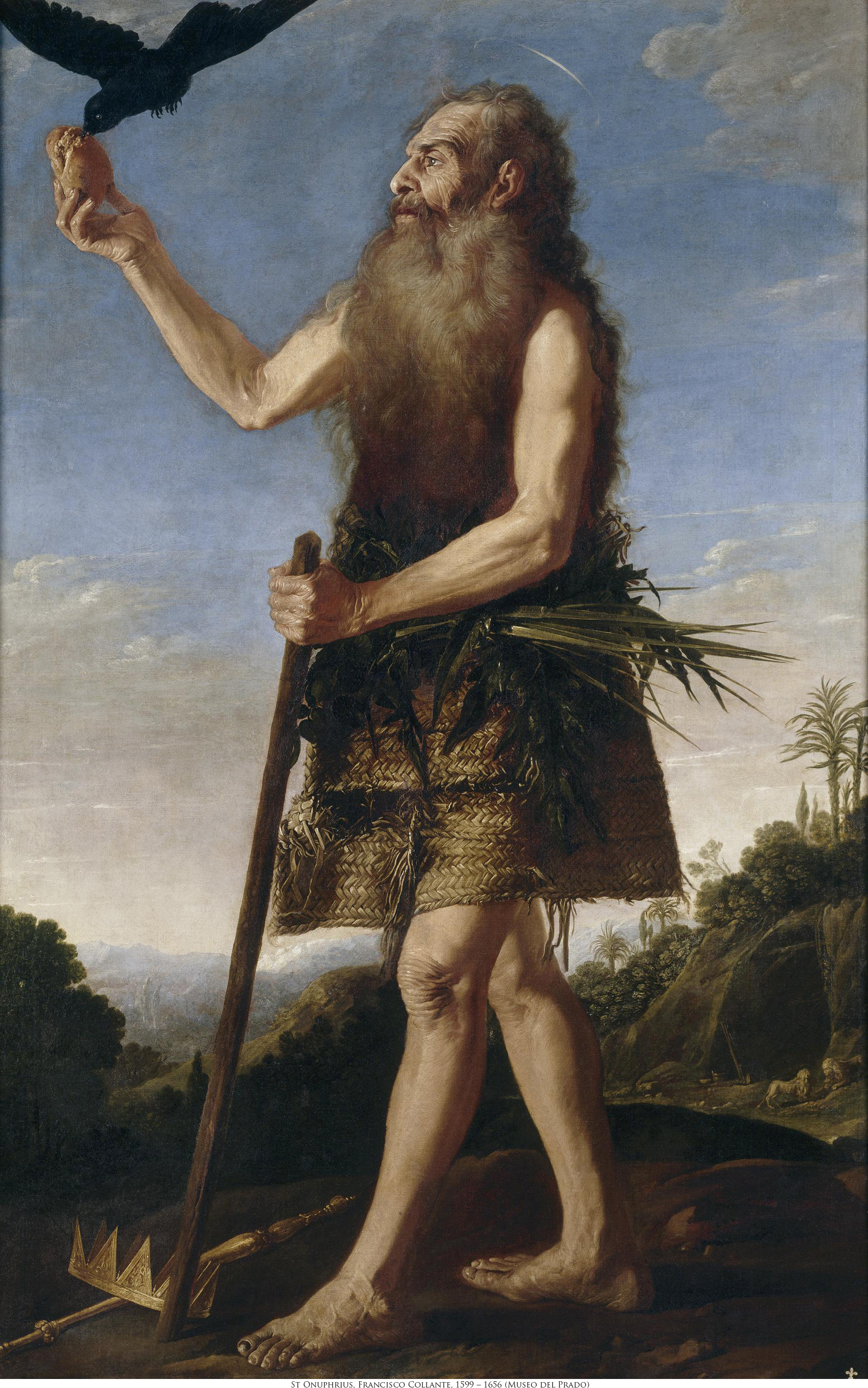
Fig. 8-8: St. Onuphrius, Francisco Collante, 17th century
Given the presence of so many saints and halos, I'm compelled to confess a sin. The original of this image file is peppered with dozens of watermarks reading Museo Nacionale del Prado. Wikipedia seems to be careful with its copyrights, so presumably this reproduction really is in the public domain; but if they have it wrong, so did I in removing them.
Wybrand de Geest
Wikipedia entry for Wybrand de Geest
De Geest lived from 1592 to 1661 in Holland, a contemporary of Rembrandt's and married to Rembrandt's sister-in-law. As with St. Onuphrius, the beauty of this painting definitely does not emanate from the beauty of its subject. I marvel that His Worship permitted De Geest to paint with such relentless realism...
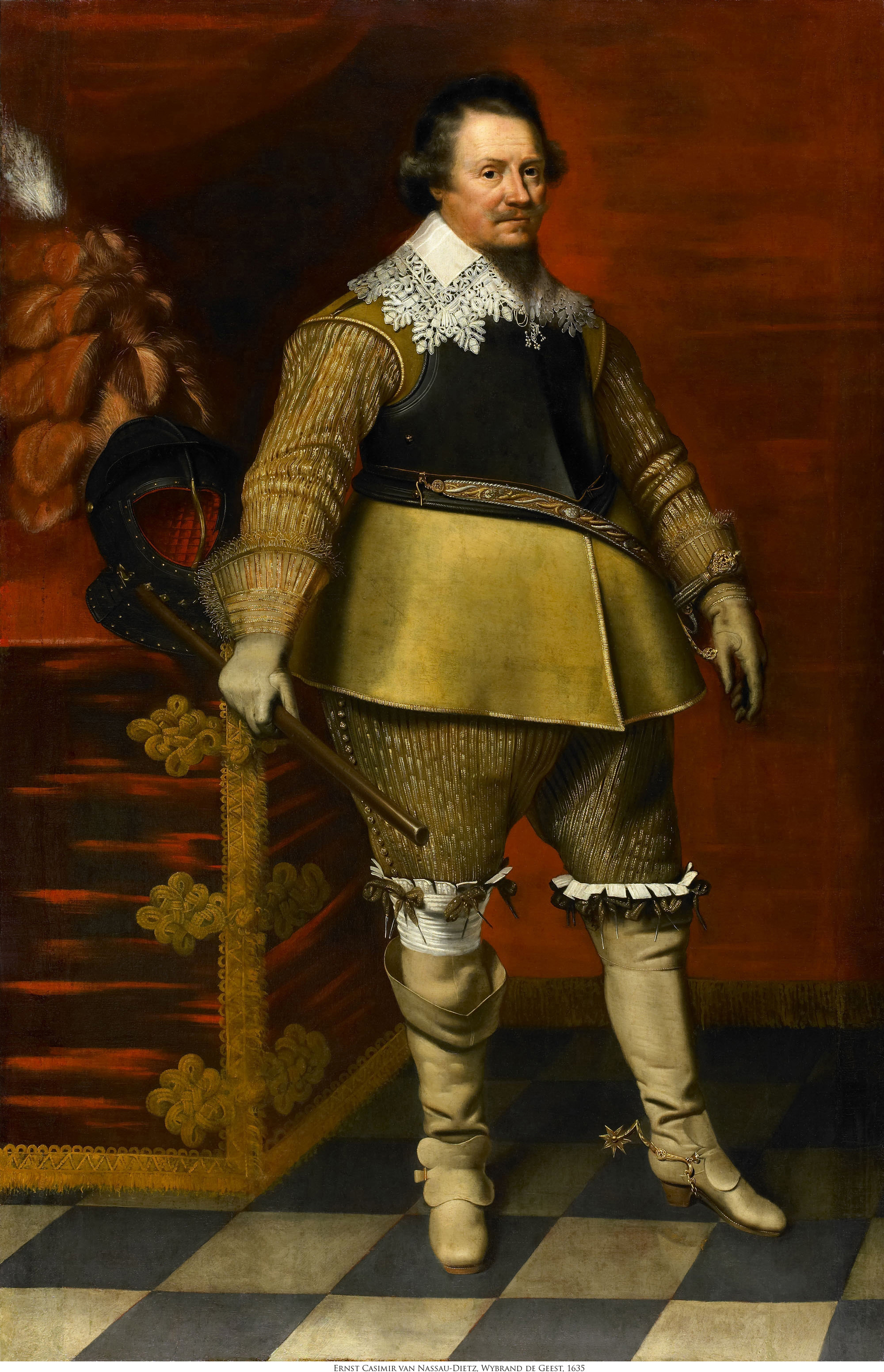
Fig. 8-9: Ernst Casimir van Nassau Dietz, Wybrand de Geest, 1635
Willem van de Velde
Wikipedia entry for Willem van de Velde
Willem (the Elder) lived from 1611 to 1693, moving from Holland to England toward the end of his life. Wikipedia tells us "He was the official artist of the Dutch fleet for a period"; what's obvious from the following painting is how perfectly his encyclopedic knowledge of naval craft is married to an equally awesome skill as draftsman. The reproduction we have is exceptionally large and has the unfortunate duty to reflect in excruciating detail the degree of damage this picture acquired over the centuries, which you can see by downloading the original.
The technique, called grisaille, is new to me, but apparently refers to painting on canvas in monochrome or very limited palatte rather than full colour. It took me dozens of hours to repair the original image file. At first I was convinced the painting was done on parchment or leather, but after a few days it became clear that the crack-and-groove texture was due to the condition of the undercoat or overcoat of glaze; the weave of the canvas does show through in various places. Here are two versions of the picture. The first is from an intermediate stage in my restoration with only actual damage removed; print this one if you prefer a stronger reminder of the passage of time:

Fig. 8-10: Dutch Flagships at Sea in a Moderate Breeze under Easy Sail, Willem van de Velde, 1672 (minimal restoration)
The second reduces the maze of cracking, warping, and discolouration to arrive at something I hope is much closer to what the artist would have seen upon finishing his epic labour:
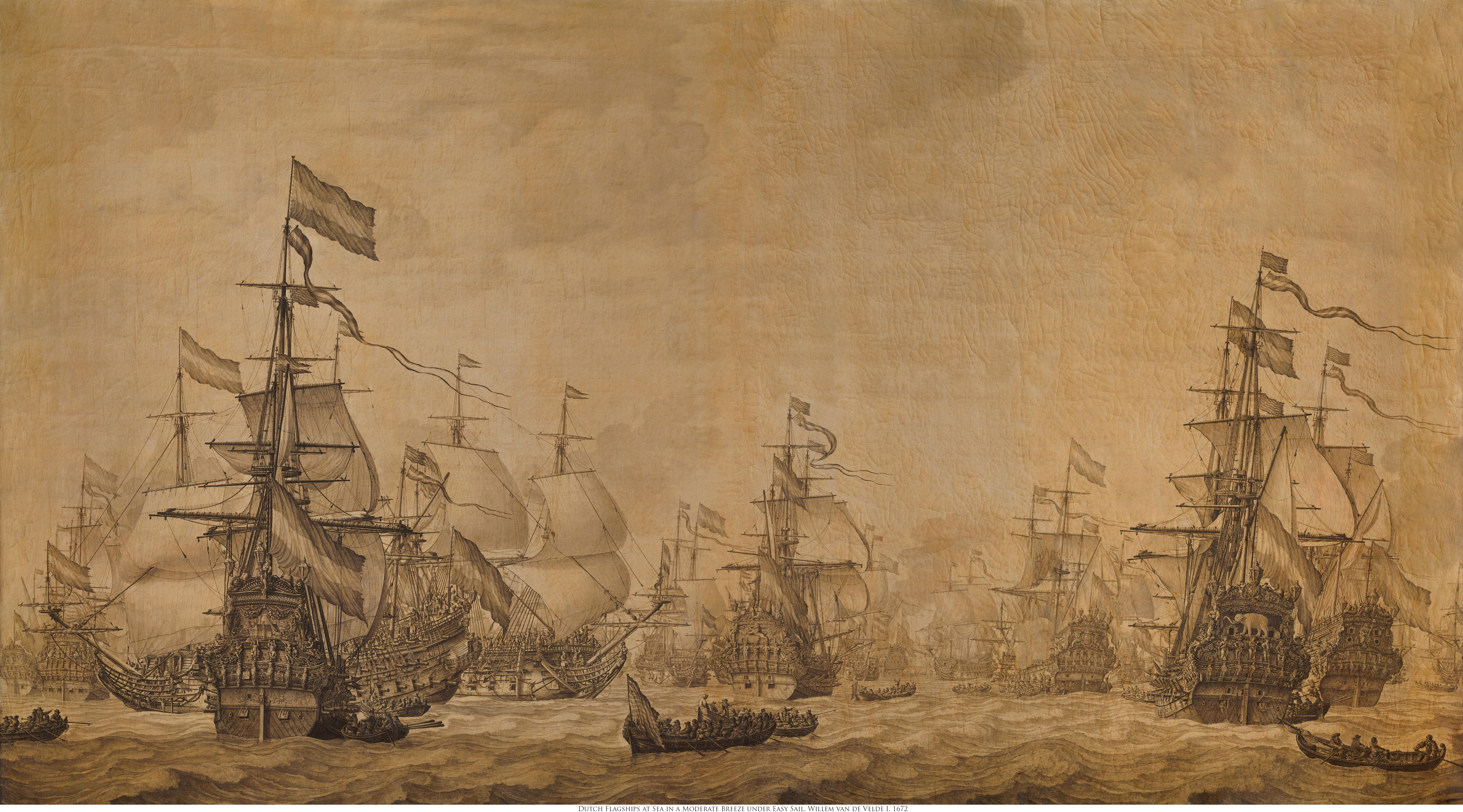
Fig. 8-11: Dutch Flagships at Sea in a Moderate Breeze under Easy Sail, Willem van de Velde, 1672 (extensive restoration)
The original is some 44 by 80 inches; and the image file fully repays perusing at even 200% mag. Every one of the cast of thousands has a distinct face; and several of the ships, detailed right down to the nail heads, have been identified from other records. I personally printed this on matte paper at 16 by 33 inches: roughly the maximum size possible from my printer.
Consider, for example, this small detail from the right of Fig. 8-11, which incidentally you're seeing here at roughly the same scale as the original:
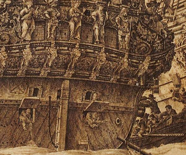
Fig. 8-12: Detail from Fig. 8-11
I had no idea Dutch battleships were so ornately decorated. At the rate all wooden vessels went down, whether from storm or from battle, investing so much effort and expense seems almost madness. Nor did I realize such ships had stern hatches. What are the two sailors in the two open hatches doing? Bailing water? The entire image is chock-full of such fascinating vignettes.
Willem van de Velde II
Wikipedia entry for Willem van de Velde II
Son of the previous painter, Willem II lived from 1633 to 1707, again first in Holland, then England. Based on these two exquisite canvases from his last year, history has served him very poorly indeed. To my eye, Willem II is a true heir not just to the nautical knowledge of his father but to the masterful brushwork of Rembrandt – which is high praise indeed considering the prices Rembrandts fetch:
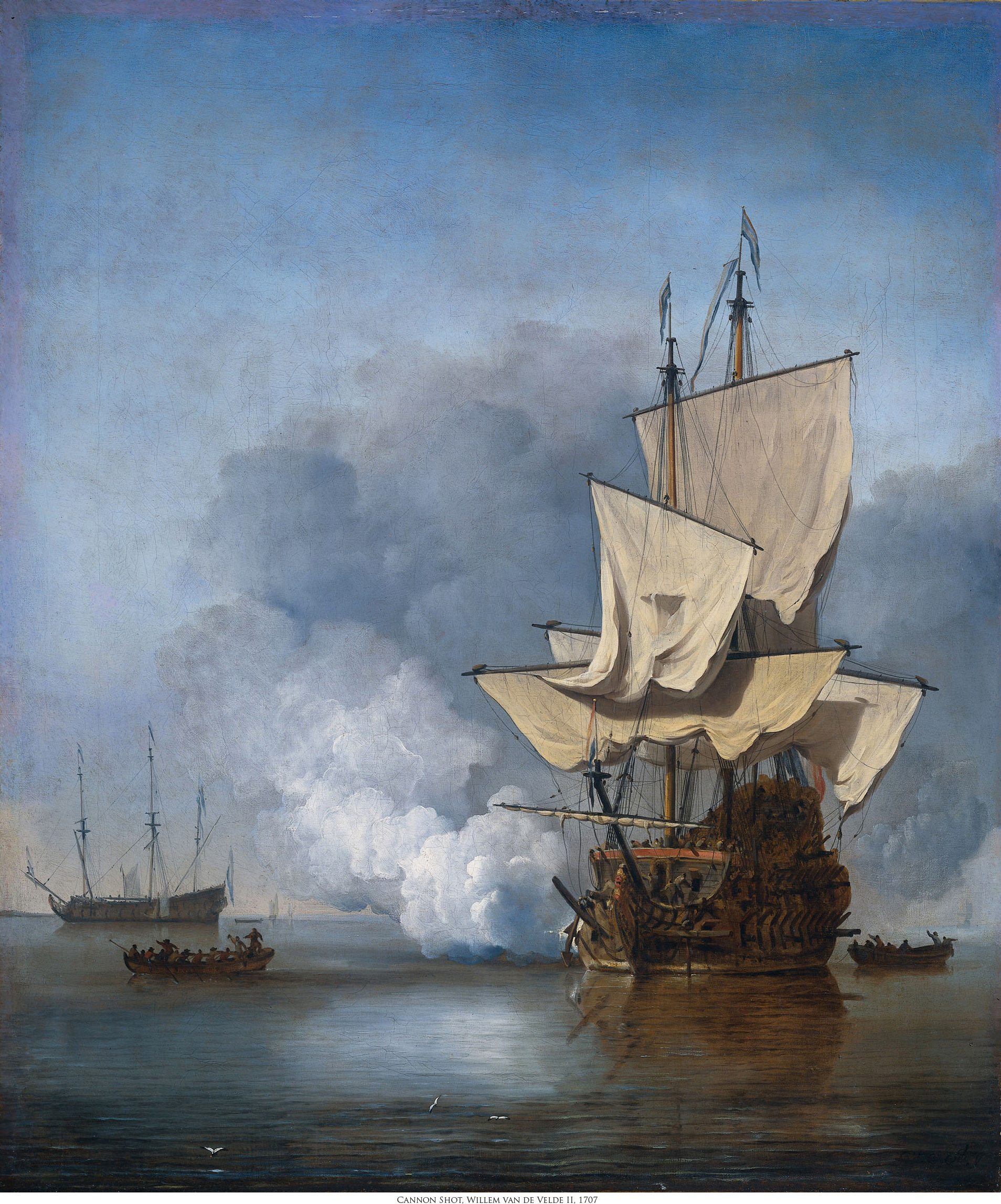
Fig. 8-13: The Canon Shot, Willem van de Velde II, 1707
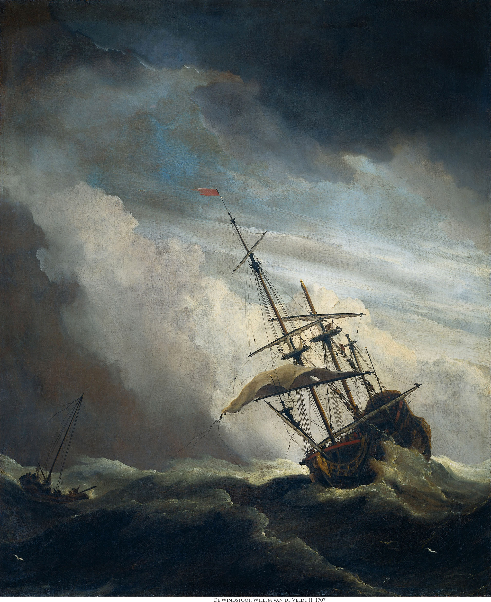
Fig. 8-14: A Ship in Need in a Raging Storm, Willem van de Velde II, 1707