Practical Aesthetics for the Art Photographer:
Controlling Emotional Tone
page 1, version 2.0, ©2004-2005 by Dale Cotton, all rights reserved.
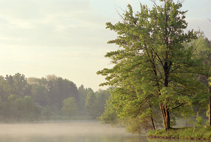
Fig. 1: 44-19 straight out of the scanner
Fig 1 is how this frame of Reala film, exposed on May 23, 2001 at roughly 6:30 am, looks fresh from the scanner. Viewscan's white balance has gradually become remarkably accurate in spite of the difficulties inherent in colour neg film. However, this interpretation of the scene is purely Reala's – any resemblance to reality is purely coincidental. For one thing, film assumes a) that there is a single colour temperature of the lighting, and b) that this temperature is 5000° K ... not likely at this time of day! To truly neutralize this image the slight blue and red channel casts would have to removed differently in highlights and shadows.
But even if the film were accurate – so what? As Edward Weston once said: "Composition is the strongest way of seeing." Do we reject an exposure simply because we haven't got every single aspect of time of day, time of year, atmospheric conditions, transient elements of the scene, such as a passing flight of Canada geese, etc., etc. all congruent? Or do we do the best with what we've got? I keep coming back to this point: an art photographer is an artist and cannot abdicate his responsibility to the miniature universe that he creates with each composition simply by whinging about the vagaries of Mother Nature.
The following are three variations on the raw material of this frame. Each was done using some combination of Photoshop's Select Color Range, Curves, Hue/Saturation, Selective Color, and Channel Mixer controls. Each variation recreates a believable, but different, time of day and time of year, while retaining the delicacy of the morning mists of the original spring day scene:
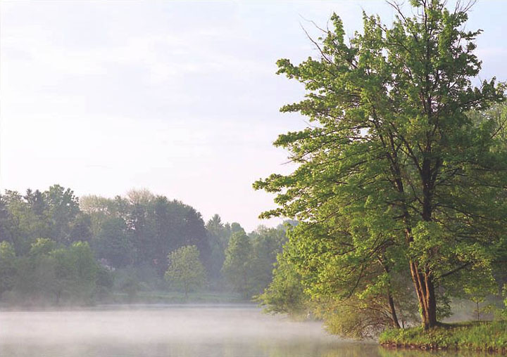
Fig. 2: First interpretation (colour and contrast restored to memory)
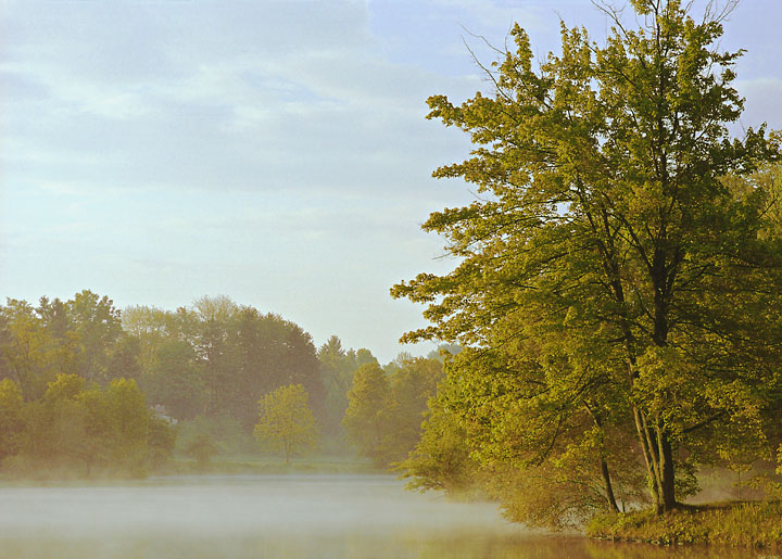
Fig. 3: Second interpretation – late September, morning light
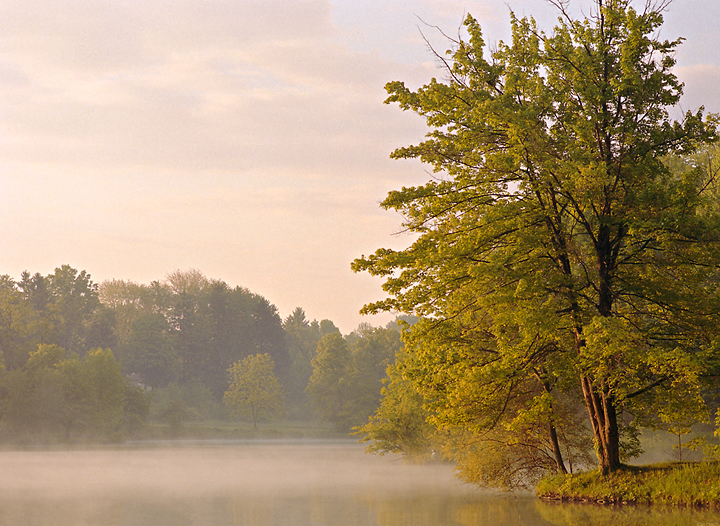
Fig. 4: Third interpretation – late September, dawn light
It may well be that after considering all the above you will happen to prefer the original, Fig. 1. It is understated and has its own emotional tone, courtesy of Fujifilm, Inc. I don't happen to prefer any one of the above interpretations over another; I find them equal but different. The point is that once the artistic process begins, the artist must control the emotional impact of his image.
In like wise, many photographers choose the far more radical and violent approach of foregoing colour altogether; but even so, shades of grey or sepia have their own emotional impact:
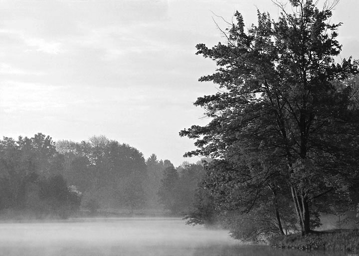
Fig 5. Greyscale
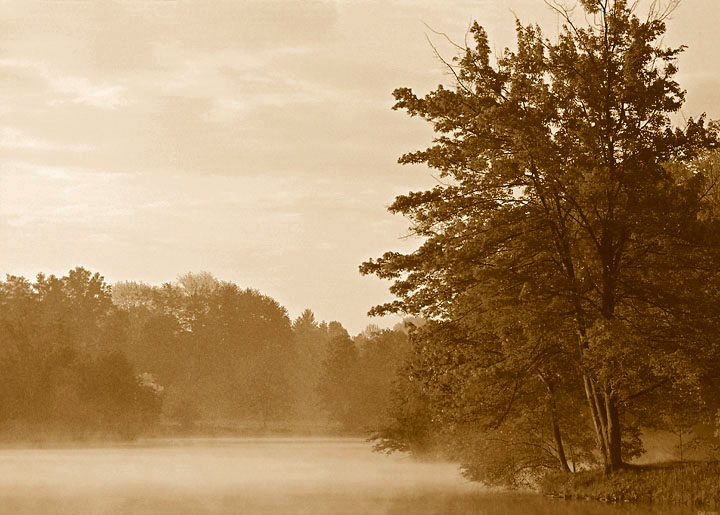
Fig 6. Sepia tritone
According to Fig 5 the sky is stormy; according to Fig 6, rain is falling. You cannot escape the fact that all colours (including grey) have an emotional charge. It's up to you to establish the emotional dialogue you want to make with your viewer.