The Art of Seeing Art
Version 1.1, © 2007 by Dale Cotton, all rights reserved.
Part 6: Colour & Contrast
You probably hoped to have seen the last of this last week, but nope: here it is again:

Fig. 1: 180-05a
Tool 3: colour
Last week we looked at the arrangement of colours in a rectangular frame, but colour itself is a critical tool in the visual artist's toolbox. Every hue invokes a different emotional response. There is enough similarity between the emotional response of different people that certain patterns have been noted. Yellows, oranges, and reds are called warm colours (presumably because of their association with flame). Most people find warm colours to be inviting and cheery. Blues and greens are called cool colours and tend to invoke a calm response and to stay in the background. White, black, and shades of grey are neutral; tans and browns, slightly warm.
Click on the following button and notice your immediate emotional response (mood change) to the different colours that appear:
This bit of JavaScript magic by David Taylor of Clackamas Oregon fills the rectangle with randomly generated colours. To me, in general the lighter colours are lively and darker are somber; the warm colours are cheery and the cool colours wistful, just as theory suggests – but of course each particular colour has its unique feeling tone.
If we look again at Fig. 1, the sky is a mix of cool colour (blues) and neutral colours (greys); the driveway is neutral (dark grey), as is the barn (off-whites and black). The field is the only source of warm colours, although even it is more cool (dark green) than warm. Yet the barn, at least to me, catches the eye first, in spite of its neutral colours. This is because of its strong simple shape together with the strong contrast betwen the off-white of the siding and the darks of the roof, windows, and doors.
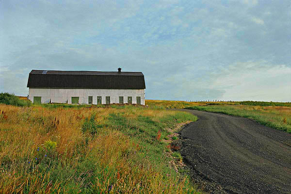
Fig. 2: 180-05, (tastefully?) increased saturation
In Fig. 2 I've modified the original picture by increasing the saturation or vividness in the warm colours in the field and the blues of the sky. (Technically, saturation means the degree to which a given colour approaches purity.) We tend to find saturated colours more appealing in the same way that a child prefers to eat candy over cauliflower, but increased saturation also tends to turn up the emotional volume, which is why Van Gogh increasingly pushed his colours to the max.
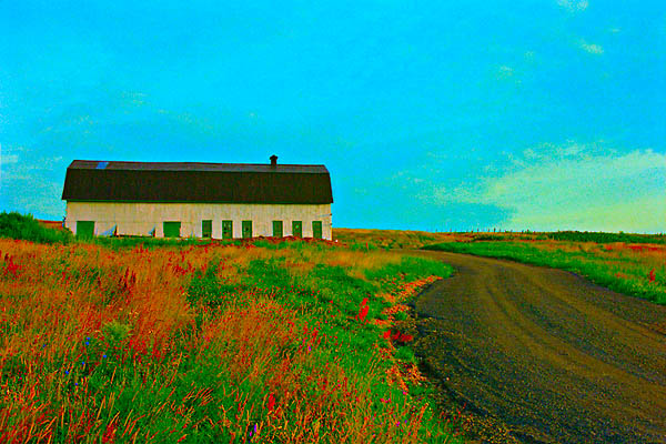
Fig. 3: 180-05, extreme saturation (just in case you were wondering ;)
Tool 4: contrast
Contrast is technically an aspect of colour; but it's useful to treat it separately. The word contrast refers to a distinction between extremes of any aspect, but in visual art it is most often used as shorthand for a contrast in brightness. In Fig. 4 I've cranked up the contrast by making the darks darker and the lights, lighter:
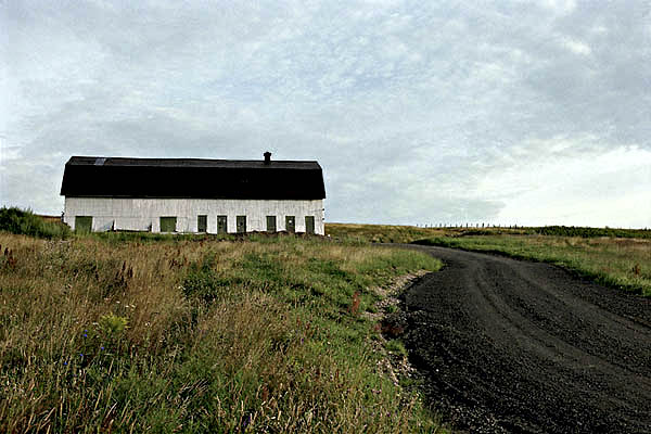
Fig. 4: 180-05, increased contrast
Increasing contrast generally adds drama; like saturation it offers another way to increase vividness. Taking contrast to the max gives us nothing but black and white:
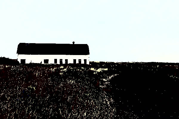
Fig. 5: 180-05, extreme contrast
Finally, if we twiddle with the knobs for both saturation and contrast looking for something useful, we might get something along the lines of Fig. 6:
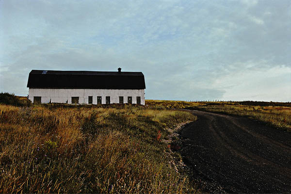
Fig. 6: 180-05b
* * *
Next week we'll look at two more tools in the artist's bag of tricks: abstraction and distortion. Rejoice! You've seen the last of 180-05 in all its varied guises. ;)