The Art of Seeing Art
Version 1.1, © 2007 by Dale Cotton, all rights reserved.
Part 7: Four More
The next two tools we'll look at are both aimed at generating the illusion of three dimensionality within a two-dimensional plane. They've become so familiar to us since the Renaissance that I only mention them for the sake of completeness:
Tool 5: shading
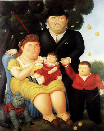
Fig. 1: Fernando Botero, Familia (1989)
In Fig. 1 the illusion is that there is a source of light up and to the right that is making the upper light side of things lighter and the lower right side of things darker. We see this clearly on the woman's arm and legs.
Tool 6: perspective
Perspective refers to the set of rules for creating the illusion of three-dimensional depth on a two-dimensional surface, as in
Fig. 2: 07-L5662
The general idea is that the image has a horizon line at the height of the viewer's eyes, and that there are one or more vanishing points that the viewer looks toward; then lines can be drawn which meet at the vanishing points in the picture but which would run parallel in a three-dimensional space.
Learn more about this subject here.
Tool 7: abstraction

Fig. 1: Armand Guillaumin, La Place Valhuber
We've already touched on abstraction or simplification when discussing Twin Lakes November #1 in Part 3 and To Prince Edward Island in Part 4. Picasso once said that "to paint from nature is to draw toenails"; by which I think he meant that adhering strictly to realism forces the artist to include detail that adds nothing to the strength of a composition. Abstraction has been an integral part of visual art since at least the cave paintings at Lauscaux. We see it operating in Egyptian art, African art, Amerindian art, etc. In fact, before photography it was only with the rise of strict realism during the European renaissance that art was created without abstraction.
It took the radical break of the Impressionists in the 1800s to re-introduce abstraction to European art. European realistic art had increasingly been done in the studio; Impressionist pioneers probably introduced abstraction in their attempt to paint as much as possible of a picture while working in real time in front of their subjects. (Paradoxically, Impressionists were striving to capture the fleeting effects of shifting sunlight, weather conditions, and subject motion at the same time that the technology of film photography was being developed; although it would take a century for film photography to achieve sufficiently short exposure time to become a useful alternative.)
What we can see especially clearly in Fig. 3 is that a side effect of abstraction is to add dynamism by strengthening the composition:

Fig. 3: Lawren Harris, North Shore, Lake Superior
One downside also evident in Fig. 3 is that a picture can become so simple that we may be in danger of losing interest after repeated viewing. Another downside – especially with the sort of clean lines and sculptural shaping we see in Fig. 3 – is perhaps a tendency to resemble a cel from an animated cartoon. But, then, these are minor criticisms compared to what the art establishment initially had to say about the French Impressionists. ;)
Tool 8: distortion
The artist usually chooses to employ distortion for either of two reasons. One is to enhance the purely aesthetic or visual aspects of the picture. In Familia, Fig. 1, we see that Fernando Botero (like Renoir and Picasso before him) has chosen to enhance the structural strength of this picture by increasing the amount of surface area within the painting that each figure occupies. Because the figures are rendered realistically, we interpret that choice by seeing the figures as being swollen or overweight.
The other reason to employ distortion is to increase the artist's ability to portray not just what he sees but also what he feels about what he sees. Alfred Wallis has abandoned the use of scale, perspective, realistic colour, and realistic shape in this picture to more forcefully convey a mood:
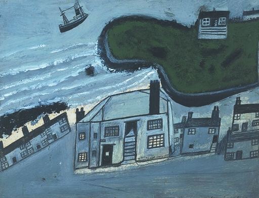
Fig. 4: Alfred Wallis, Hold House Port Mear Square Island
Because perspective has been violated, the green lawn and house appears to hang over the row of blue-grey buildings as if caught in the instant before smashing down on them. Because we cannot help but interpret the scene three-dimensionally, the factory seems to be slipping down a slope, and the ship appears to be soaring into the sky. The sum of which is to introduce a dream-like and child-like atmosphere to the scene that further refines the emotional impact.

Fig. 5: Van Gogh, Red Vineyards near Arles
The most obvious distortion in Red Vineyards is the sumptuous colouring. We can't know to what degree Vincent has simply stepped up the saturation on the presumably sunset colours he saw; and to what degree he actually re-coloured the scene. In sum the colours create an emotional intensity or purity that simply could not have been achieved had he simply recorded the actual colours of the scene.
Beyond colour considerations, Vincent has employed more abstraction than distortion of shape, and perspective and scale have been honored more exactly than in some other Van Goghs. But the primary distortion is that the entire picture is composed as a tiling of largish interlocking brush strokes that command its structural integrity as a two-dimensional object.
* * *
The end is nigh: stay tuned to this same channel for Part 8, a report on the business of art; the Frolic of the Egos in the world of art./p>