Lessons in Composition for the Art Photographer
Version 2.3, Page 9, ©2001 by Dale Cotton, all rights reserved.
Lesson 4: Centre of Interest vs. Panorama. Richness vs. Simplicity
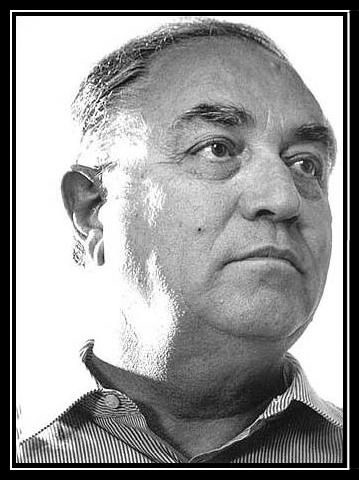
Figure 4a. Portrait ©2001 by Adam Nixon
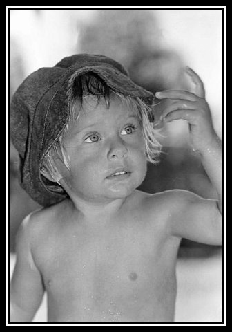
Figure 4b. Rochelle by Ron Van Santen
A portrait typically has the subject in the foreground with the background being either simple texture or narrative detail concerning the subject.
Figure 4a, incidentally, is an excellent study in unity vs. fragmentation. Notice how the person and the background are stitched together by the white glare on the left side of the man's head. On the other hand, the mathematically precise pinstripes of the shirt contrast strongly with the textures of the face and with the white background, yet in colour (tonality) they are strongly integrated.
Similarly, notice the literal line of attention in Figure 4b. Who can escape following Rochelle's hypnotic gaze at her own hand? She seems to be waiting for a modern Michelangelo to sculpt her in pure Carara marble.
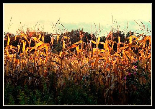
Figure 4c. Cornfield
A photograph may or may not have anything meaningful in the foreground; and the foreground may or may not dominate the background. The subject of a photograph may be the entire scene. Your picture may be saying: "look at the pattern this field of dead corn makes against this sombre forest and sky." The pattern is then the subject, if there needs to be a subject. Is there a lead role to A Midsummer Night's Dream, or can we live with the ambiguity?
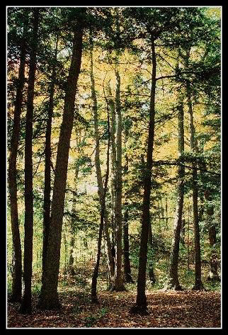
Figure 4d. Forest
When I started studying photography I came across a picture taken in a forest that rather caught my eye. Reading the text, I found that the photographer had included it as an example of a "poor" composition taken from his earlier work. There were ferns, a fallen rotting tree trunk and standing trees that formed a certain pattern. The photographer asked something like "but what is the subject (centre of interest) of this photo?" I have seen similar pronouncements on the Internet. Some professorial windbag has obviously done a number on the photographic community. Go look through a book of famous paintings from about 1700 to 1900 for a famous painting with no clear centre of interest. It shouldn't take you very long to find one. They're called landscapes (or seascapes or what-have-you-scapes). The subject of Figure 4d is simple: trees are pretty!
In a sense the photographer described above is quite right. He is a professional who makes his living selling commercial art to magazines. Any commercial magazine editor going would certainly have rejected the bad example photo. So would Ansel Adam's Canyon de Chelly National Monument, Arizona have received a polite rejection notice, if the name Ansel Adam's were still unknown. If you are trying to sell to the mass market or to win a photo contest, you want to strive for what I call eye candy. As far as I know the rules of eye candy are something like this:
- Use bright, crayon box colours
- Have a "strong" subject or centre of interest off-centre in your picture
- Keep the picture as simple as possible; eliminate busy-ness
- Take a picture of something out of the ordinary, but not controversial or "ugly".
You can apply the same formula for designing successful advertisements or product packaging. Figure 2a would seem to be a good example of such an image:
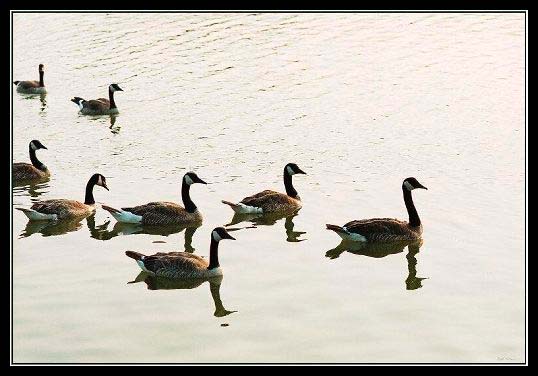
Figure 2a. Canada Geese
...or are the colours too dull? ;)