Matting and Framing Crash Course
Page 4, Version 5.2, ©2002-2005 by Dale Cotton, all rights reserved.
Selecting an Over-mat
We have all seen professionally matted art work. The mats (technically overmats) are thick cardboard with a (~45 degree) beveled edge around the cutout for the image. Because the core of the mat board is white with a thin coloured veneer on top, the bevel is white and the rest of the mat coloured (see Fig. 1).
Note: The over-mat is not just decorative; it's primary function is to keep the print from direct contact with the glass, to which it would eventually adhere, making it impossible to remove without destroying it.
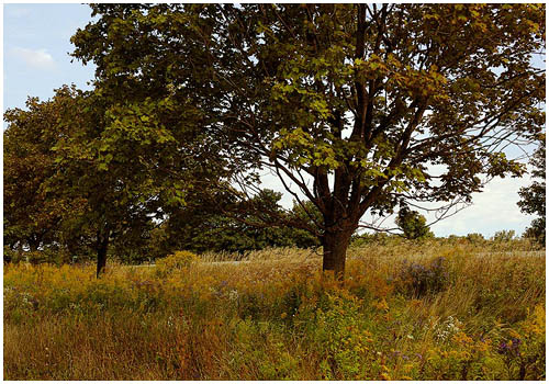
An off-white mat board is considered de rigeur by the conservative photography community. I frequently use a dark olive, but in every case I suit the mat colour to the image. Ansel Adams used a white mat but preferred to have gallery walls on which his photos hung to be 18% grey or other 18% reflective neutral colour, as in Fig. 5 below. You could paint your house or gallery accordingly ;) For most prints I prefer to use a mat colour that is medium dark or darker. I am looking for a combination of mat colour and print colours for which the mat becomes a neutral background, leaving the print as the centre of attention. Since mat board is expensive, You might want to use your graphics software to experiment with mat colours and sizes around some of your photos before making a purchase.
For now, here are some generic photographs and some common mat colours. Try mixing and matching mat, frame, and wall colours to surround whichever image is closest in colour content to the one you want to frame:
|
Fig. 5: Mix and match:
3) Change colour to:
I think you can see from playing with the above that the commonly expressed idea that the over-mat serves to isolate the picture from the wall is bogus. Certain combinations of brightness – never mind hue – among wall, mat, and frame colours are jarring (try a white mat on a white or off-white wall). One way to proceed in choosing a mat colour is to first narrow your choices down by brightness. You can do that by using the Zone grey scale options above.
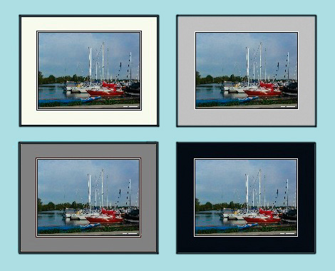
Fig. 6: Selecting an over-mat tone
In Fig. 6 I've illustrated four different mat tones. For me, the medium grey mat not only dominates the photo, it also depresses, or mutes, the colours of the photo. The light grey mat depresses the photo to my eye to a lesser degree.
The white handicap: The next time you're driving into the sun try doing so without your sunglasses. Your irises will contract to pinpoints and still you'll squint. Your irises have to contract so that the brightest part of the scene is tolerable, which makes everything else in the scene darker and harder to see. A white or off-white mat has exactly the same effect, if to a lesser degree – and that's over-powered by the brightness of a light-coloured wall in a day-lit room.
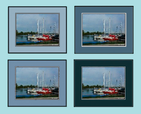
Fig. 7: Finding a mat hue
Once you have a desirable tonality, you can try different hues. In the next four variations I've used the eye-dropper tool to select shades of the blue (the predominant colour) from the image itself then filled the mat areas with those colours.
Another issue is the width of the matted border. In this example we are using approximately a three inch width. Clearly this measurement will have to be the difference between the dimensions of the print and the dimensions of the frame. But if you have a choice in frame sizes, then you may wonder which size to choose. Again, this is very much a matter of personal taste and what looks best with a given image. If you want a rule of thumb, try this:
The image area of the print is 12" x 18", which equals 216 sq. in. The total area inside the frame is 18" x 24", which equals 432 sq. in. If we subtract the image area (216) from the frame area (432) we get 216 again. So a total mat area equal to the total image area is probably a good starting point.