Digital Editing 101
Following an Art Photograph from Capture to Print-Readiness
Page 3, version 1.3, © 2006 by Dale Cotton, all rights reserved.
Editing, continued
Now that I can concentrate on the foreground, I use the yellow channel (slightly expanded) of the Hue/Saturation tool to desaturate and shift to a warmer hue:
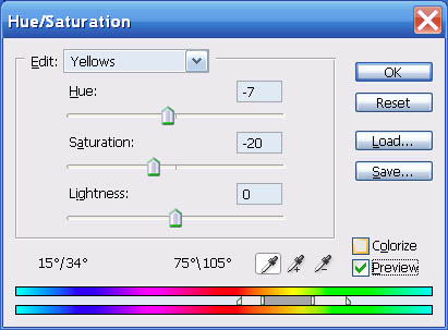
Fig. 8: Hue/Sat yellow channel adjustment
The Master channel of the Hue/Sat. tool is a fairly blunt instrument. For refinement either create a selection of your image before going into Hue/Sat. or use the colour channels and their sliders to limit its reach.
Now I do want more contrast, so I use the following curve:
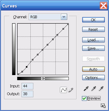
Fig. 9: Second contrast curve
– which locks down all but the shadows then deepens the near-blacks. Here's where we are now:
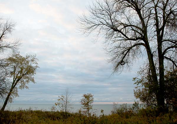
Fig. 10: After foreground edits
I like the foreground pretty well, but the change in hue clashes a bit with the sky, so I invert the selection and head back to the Hue/Sat. dialogue to tweak the sky and water hue to an even bluer shade:
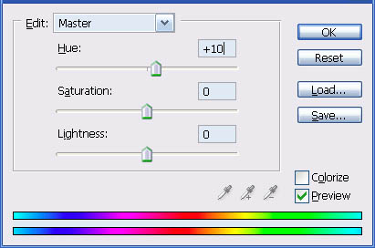
Fig. 11: Hue/Sat colour shift
... And surprisingly – that's it. I remove the sky selection and try to find a curve to further enhance the drama of the stormy scene, but no joy. I try selecting just the goldenrod along the shore line and bringing the yellow colour of that out more, but no joy. So now to peruse the image carefully at 200% mag. and deal with any defects like the chromatic aberration in the upper right:
Fig. 12: Chromatic aberration seen at 200% mag.
What else to use for CA zapping but our trusty Hue/Sat. dialogue? My CA remedy is to lasso an area containing CA, go to Hue/Sat., change to the appropriate channel (usually magenta or yellow (for lime CA), narrow the colour range as needed, then move the saturation slider to desaturate as needed. (I've saved a number of successful hue/sat. adujstments for re-use as needed.)
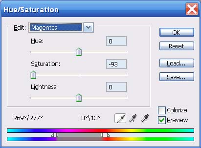
Fig. 13: Hue/Sat. magenta channel to remove magenta CA
I also cloned out a few disorderly bits of undergrowth and would have also cloned out any waste paper, pop cans, etc. if there had been such.
All that's left is to prepare the image for printing and/or computer display. My own routine involves upsampling to 150% then doing some hocus-pocus to crispen the acutance to something more like the painter's brush strokes that I'm attached to. For most people it's more a matter of sharpening to taste with USM or some third-party tool.
Coming back to this image a day later with fresh eyes, the only thing that bothers me is that the acolyte tree on the left is too dull. I circled the tree with the lasso tool in Photoshop, then used Select->Color Range... to select just its leaves. I then applied the following Hue/Sat. and Curve to bring it more in line with the rest of the foliage:
Fig. 14: Acolyte leaf selection
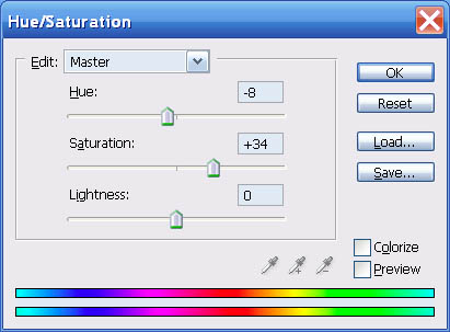
Fig. 15: Acolyte colour shift
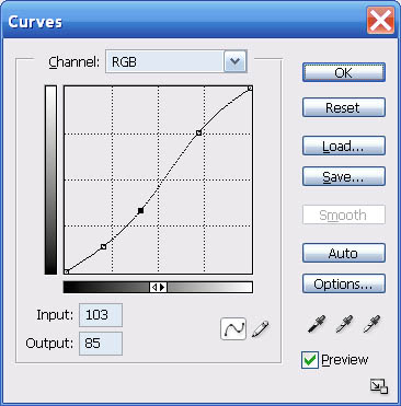
Fig. 16: Acolyte contrast curve
Which brings us full circle to the hopefully now final version:
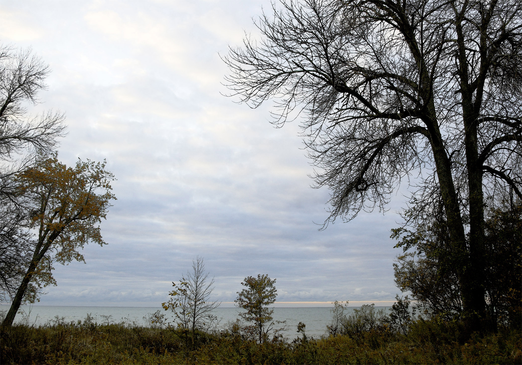
Fig. 17: Final cut (click to enlarge - warning: 1 MB file)