Lessons in Composition for the Art Photographer
Version 2.3, Page 12, ©2001 by Dale Cotton, all rights reserved.
Lesson Five (continued): Final Exam
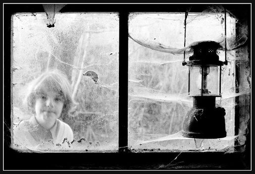
Figure 5b. Janice ©2001 by Ernest Minns
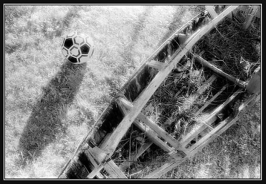
Figure 5c. Boat and Ball (15) ©2001 by Ernest Minns
Analyze these two gorgeous tours-de-force (at least for me) by fellow "amateur", Ernest Minns, according to each of the dynamics we've discussed:
- Unity vs. fragmentation
- Rhyme, repetition, and rhythm
- Lines of Attention
- Symmetry vs. Asymmetry
- Centre(s) of interest
- Complexity vs. simplicity
- Anything else that occurs to you!
Are there any aspects of either image that don't work for you? Are there any elements that you would have arranged differently or changed the emphasis on if circumstances permitted? By working in so-called black-and-white, the artist has deliberately limited his palette to colours that almost have to work together. How does that particular palette interact with the subject matter? Do you find it appropriate or jarring?
Give yourself points for everything insightful and less-than-obvious you come up with! E-mail your answers to me and I'll append them to this document. What I can't do is grade your exam, because of the very nature of aesthetics. There simply are no right or wrong answers to any aesthetic issue. To put it tritely: beauty is in the eye of the beholder ... which takes us back to my first point:
There are no absolute rules of composition and colour usage.
In fact, it's all just a game - so have fun ... and don't take no down-the-nose, artsy-fartsy guff off-a nobody!