Lessons in Composition for the Art Photographer
Version 2.3, Page 3, ©2001 by Dale Cotton, all rights reserved.
Lesson 1: Unity and Cohesiveness versus Fragmentation (continued)

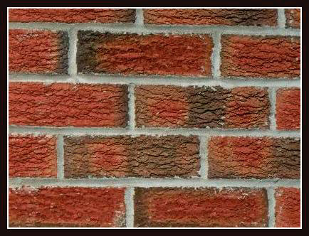
Figure 1d. Bricks
Figure 1d, on the other hand, is very nearly the ultimate in coherence, or non-fragmentation. It is also deadly boring. It could use a bit of fragmentation! Fragmentation sounds like a bad thing. Unification sounds like a good thing. In fact, to the artist they are both equally "bad" extremes. What I want as an artist is to maintain a tension, and imbalance, between the two (which we'll talk more about in Lesson 3).

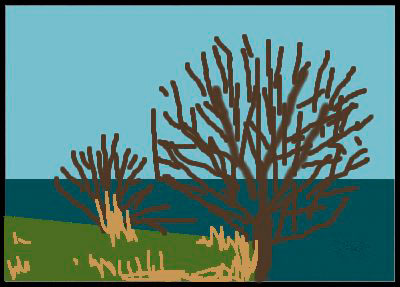
Figure 1e. Waterfront
Take away the two bare trees and Figure 1e becomes as stark, fragmented, and boring as Figure 1c. The green grass, water, and sky would have nothing to say to each other. The trees don't add a fourth region of incommunicado, even though they are all nearly one colour and that colour doesn't appear in any of the other regions.

Figure 1e. Abstract
First, the trees overlap the other regions; like stitches they literally bind the other regions into one fabric. Second, they break the sea into three fragments and the sky in two.
So much for training wheel images, let's take a look at one that really proves the point:

Figure 1f. Fishing on Lake Houma by Kerry Owen
Not only is this an epiphany of a scene and an exquisite composition but it dramatically illustrates how to make fragmentation work in one's favour. The foreground of vivid green and flowers is in one universe while the background of grey-mauve mist and trees is in another. This schism jars our sensibilities almost as much as the two halves of the diptych in Figure 1a. Yet other aspects of the image wage heroic and successful war to bind the two realities together. Perhaps the most obvious binding elements are the patch of grey-mauve gravel in the lower right corner, echoing the mist, together with the faint green and yellow patches on the spits of land and in the trees, echoing the foreground. More on echoes and rhymes shortly.