Lessons in Composition for the Art Photographer
Version 2.3, Page 8, ©2001 by Dale Cotton, all rights reserved.
Lesson 3: Energy and Directed Attention (continued)
A time-honoured starting point for creating interesting compositions is done thus. Imagine that the area of your image is divided into nine equal portions by three evenly spaced vertical lines and three evenly spaced horizontal lines. One compositional formula is to arrange the major elements of your composition so that they fall either into any of the boxes created by this imaginary grid, or onto any of the intersections.
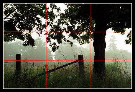
Figure 3e. Rule of Thirds Grid
In Figure 3e we see that the tree trunk closely follows the right vertical, while the fence and grass follow the lower horizontal.
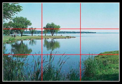
Figure 3f. Rule of Thirds Grid 2
In Figure 3f we see that the horizon is roughly at the upper horizontal; the foreground reeds and grass shoulder follow are bounded by the lower horizontal; the grass shoulder also fills the lower right box, which is echoed by the leafy branch in the upper left.
The rule of thirds is meant to foster pleasingly asymmetrical compositions; but, given we can place things on any grid line(s), we can have symmetry in thirds as well:
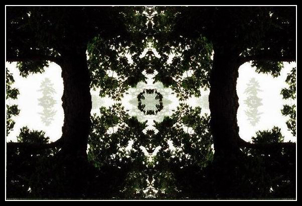
Figure 3g. Symmetry in Thirds
If the underlying motivation for any composition is to engender dynamism (or at least to avoid lethargy), we can literally tune the level of energy by choosing our degree of asymmetry:

Figures 3h. Off-centre
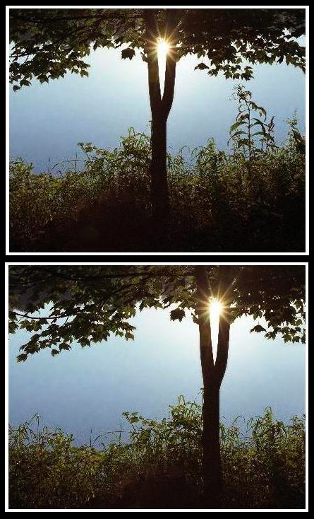
Figures 3i and 3j. Variations
Strangely, I'd say that the rule of thirds version (3j) is more serene and stable than dynamic. The pure symmetry version (3i) has plenty of energy, perhaps that of a ballerina poised on her toes, while perhaps erring on the side of being precious. But 3h, the slightly off-centre version, is the crop I chose for this image. To me there is a subtle tension in the slight asymmetry. It's not a matter of right and wrong, but of what works for you.
Note to obsessive-compulsives: Ultimately, the rule of thirds is like training wheels on a bicycle: it's secret purpose is to break the iron grip that centering the subject smack in the middle of the frame has on the beginner's psyche. Artists are rarely good at maths; and in the hands of a veteran artist the rule of thirds quickly degenerates into the rule of thirty-thirds. Therefore do not fret whether the major elements of your composition fall precisely on a thirds point: let your intuition guide you to the strongest statement of your theme and all will be well.
Exercises for Lesson 3
Create a lines of attention map for this picture:

Figure 3k. Arapahoe Bristlecone © 2001 by Norman Koren
Do the same with some of your own pictures. Also with your own pictures try to find at least one that seems to work as a rule of thirds composition, whether horizontal or vertical.
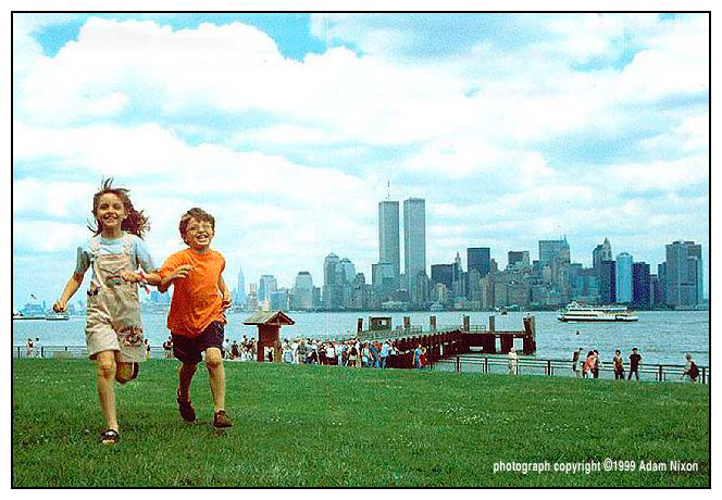
On page 1, referring to the picture of Frontispiece #1. Girl, Detroit 1966, I asked "Why is the young lady in the above picture not centered in the frame? Was there some reason to include the window?". Similarly, referring to Frontispiece #2. Twin Towers, 1999, I asked "Would you have put your own children off to one corner of the frame, putting the twin towers and ferry dock in the centre?". Consider how you would answer these questions now.