Lessons in Composition for the Art Photographer
Version 2.3, Page 7, ©2001 by Dale Cotton, all rights reserved.
Lesson 3: Energy and Directed Attention (continued)

Figure 3c. Silhouettes
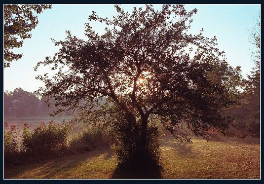
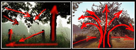
Figure 3c uses a standard compositional device. The most dominant element of the picture is the tree trunk on the right. The wooden fence posts and gate diagonal together constitute a nearly equal element. Yet neither element is centred in the scene, as the tree in Figure 3d is:

Figure 3d. Crabtree

Figures 3c & 3d. Lines of attention
Again, don't look for a simplistic rule that asymmetry is good and symmetry bad or vice-versa. Look instead at the lines of attention: are they
- Appropriately dynamic
- Binding the entire scene into a whole
- Forming an interesting pattern?
...Or just remember to ask yourself: "are all the parts of this image bound together (that I want bound together) by some non-blah pattern of attention?"
Many powerful and successful images have been created around a symmetrical composition. In these cases the creator is clearly asserting the symmetry, making it a central theme of the image. The underlying principle is again energy or dynamics. You want to be aware of symmetry versus asymmetry; you want to strive for the appropriate level of energy to match your subject. (And, of course, that rule is made for the breaking too.)
Going back to unity/fragmentation, note how both these images have a very limited pallette and how the same colours are repeated and rhymed throughout each image, creating cohesion. (One might say that they are colour co-ordinated!)