Digital Editing 102: Making it Sing
Project 1: easy does it
page 3, version 1.3, © 2009 by Dale Cotton, all rights reserved.
B. Local changes 1: pallet
This image is extremely unusual in that I have no urge to further fiddle with the colours. The slight warming in Lightroom is all I need. Specifically, the sky is a pure sky blue, the various hues in the vegetation all work together, and there is already enough variety of hue that I don't feel the need to extend the pallet. We'll make up for that in the second half of this tutorial, so don't feel cheated... ;)
C. Local changes 2: contrast
Another rare thing: the sky is already perfect right down to the contrast between clouds and clear blue areas and there is even a pair of usably sized, perfectly positioned birds just in case anyone finds the large area of sky on the left to be too plain.
However, the foreground still shows the relatively flat contrast of Lightroom's linear contrast "curve". How much we change that will strongly set the mood of the image. To some degree simply by printing the picture we will lower the contrast yet further, since paper has so little dynamic range compared to a monitor. If we apply an S-curve to the entire scene we have to be careful not to add too much contrast to those areas that already have enough. Lets see how much global contrast we can get away with:
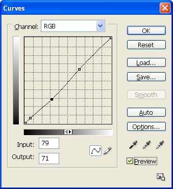
Fig. 5: Sky contrast curve
If your Curves dialogue in Photoshop only shows a 4 x 4 grid, Alt-click or Option-click on the graph area to toggle to a 10 x 10 grid.
1. Open Curves; put a stop point near bottom without moving the diagonal to prevent over-darkening the deepest shadows; play with S-curves to increase contrast; I settled on a very slight curve (PS1); but even that fraction-stop change radically increases the drama of the scene:

Fig. 6: Initial contrast change result
The only weakness of the image now is the relative flatness or uninteresting-ness of the bottom left bushes (A) and the sunlit portions of the far-right clump of trees (B) shown in Fig. 7:
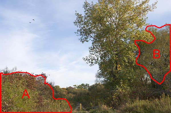
Fig. 7: Local contrast issues
2. Using the Lasso tool, make a quick, rough selection of the bottom left bushes (region A).
3. Feather about 40 or 50 pixels.
4. Using Lasso tool, reselect a swath adjoining both the left and bottom edges of the selection to remove the feathering there.
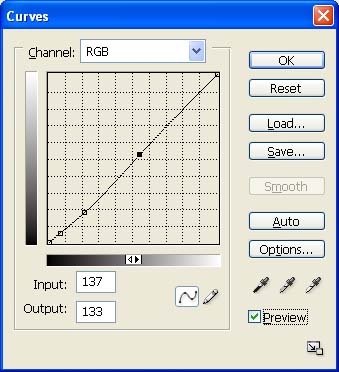
Fig. 8: Left corner contrast curve
5. Open the Curves dialogue then fiddle with the contrast. Notice that this region is actually too bright, so the curve should serve to darken it slightly as well (Fig. 8).
6. Save then cancel the selection, then make a new selection for region B in Fig. 7, again feathering except along the right edge.
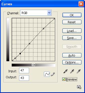
Fig. 9
7. Use Curves again to change contrast; this time I decide to slightly brighten this region as well as add contrast (Fig. 9).
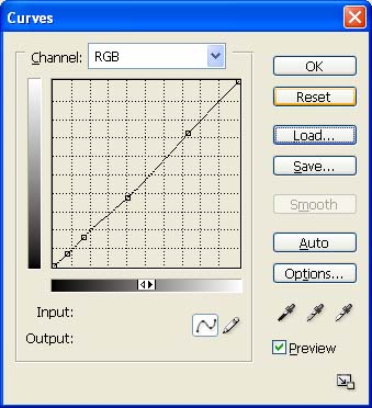
Fig. 10: Left corner contrast curve for step 8
8. Save then cancel the right trees selection. Looking at the result so far, the left bush area still looks a little bleak and bright, so I restore the save selection for region A then use Curves to further tweak the contrast (Fig. 10).

Fig. 11: Step 8 result
Stepping back to look at Fig. 11, the thing that catches my eye is that the overall composition weakens at the left and right edges. My tendency is to want to crop a bit, as indicated by the black dotted lines in FIg. 12 below. If we can save the full frame, however, that gives us more flexibility for future presentaton. For example: if I want to frame this in a 2:3 aspect ratio frame, it's good to go; if I have a 3:4 frame all I need do is crop and print a copy. Looking back at Fig. 11, what chiefly strikes me is the right-most trees still constitutes a flat, blob-like region. More contrast is not going to change that – what's needed is to re-sculpt this region to visually separate it from the large Constable tree just to its left. The yellow lines show the obvious flow of the image from right to left. What I want to do is emphasize that flow a bit more in the rightmost tree clump.
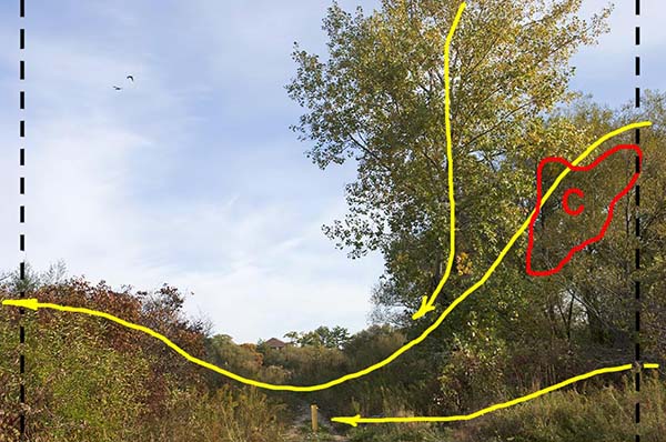
Fig. 12: Composition (yellow), problem region (red), and possible cropping (black dotted)
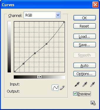
Fig. 13: Curve for step 9.
9. Make a rough Lasso tool selection of the red outlined region in Fig. 12; feather then use Curves to darken slightly (Fig. 13).
10. Set a history brush point just before that curve, then use the history brush at about 30% to undo as needed to make the change blend in.

Fig. 14: Duffins Creek Marsh 5034, final colour and contrast
That seems to be it: the starting image was already strong; I don't see anything more that needs fixing here.