Digital Editing 102: Making it Sing
Project 2: pallet power
page 6, version 1.2, © 2009 by Dale Cotton, all rights reserved.
B. Local changes 1: local pallet
While we've made all global colour changes in Lightroom, Photoshop has its nifty Replace Color tool which combines HSL with its long-standing Select Color dialogue. We'll use this in our final assault in our war against coolness:
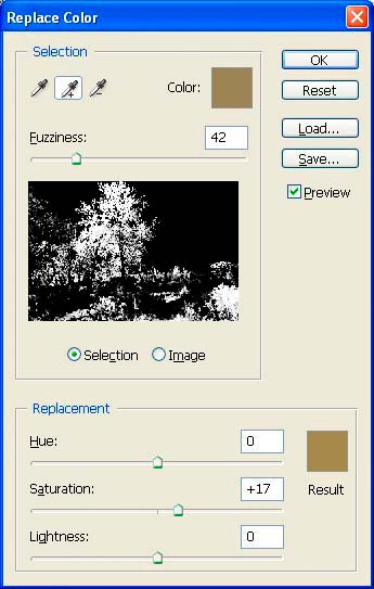
Fig. 5: Replace Color dialogue
1. Open Replace Color; click within the light "yellows" of the central tree's sunlit top region; you'll find they're really a dull ochre at best. Use the + eye dropper to add more yellows to the selection, then move the Fuzziness slider until only the yellowish parts of the picture are selected (white against black); if Fuzziness is too broad, green vegetation gets included. Goose up the saturation enough to give the image that final spark of warmth (Fig. 5). (If you're just reading and not following along in your image editor, you can see the result of this change in Fig. 7, below.)
C. Local changes 2: local contrast
I made as much of a global contrast change as I felt comfortable with in Lightroom; now to make local contrast adjustments to taste. To get started we need to make a very useful tool that I first chanced upon in Barry Haynes' and Wendy Crumpler's book Photoshop 6 Artistry.
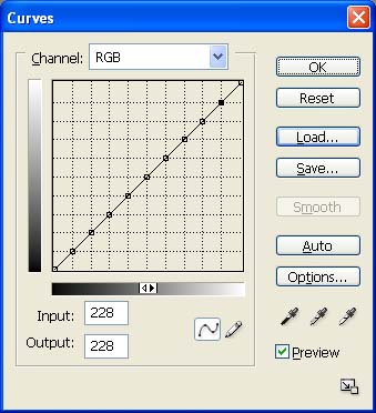
Fig. 6: 10ths curve
1. Open the Curves dialogue box; if you have a 4x4 grid Alt-click or Option-click to 10x10; carefully click on each intersection between the diagonal "curve" line and the grid. For example the bottom left intersection is at 24 by 24 and the next is at 50 by 50. If your click is not quite true, simply change the Input and Output numbers to match. When you're done you'll have something that looks like Fig. 6. Now click the Save... button and save this for future use, then cancel out to the dialogue for now.
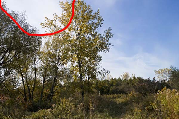
Fig. 7: Cloud glare selection
2. Make a rough lasso selection of glaring cloud; feather except top edge (Fig. 7).
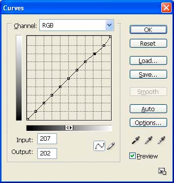
Fig. 8: Reduce cloud glare
3. Open the Curves dialogue; click the Open... button then select the 10ths curve you created in step 1; drag the highest point down and right then drag the second-highest point slightly to smooth the connection to the rest of the line. This darkens the glare in the selected white cloud.
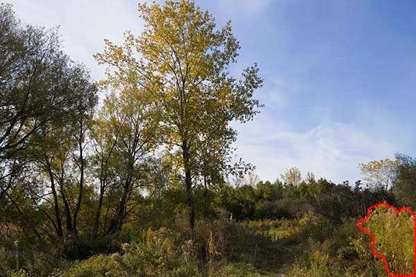
Fig. 9: Bright bush selection
4. De-select the cloud then Lasso select the lower right bush (Fig. 9); feather except edges.
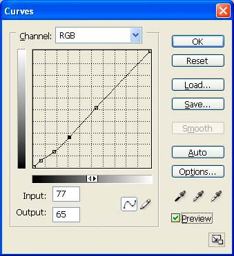
Fig. 10: darken bright bush
5. Use Curves to slight darken and increase contrast (Fig. 10).
6. On the right edge of the frame just above the bush we just changes there is a distant green tree that's totally without contrast. Select, darken, and increase contrast on that tree to taste.
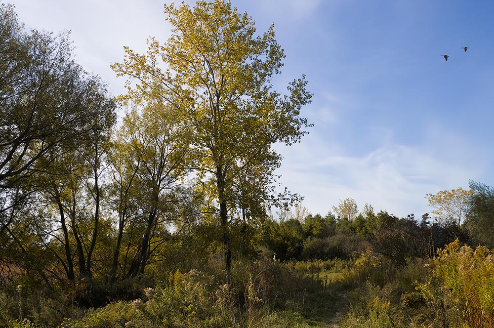
Fig. 11. Duffins Creek Marsh 5073, final colour and contrast
D. Local changes 3: local sharpening
Again, we applied as much global sharpening as possible in Lightroom. Because some of the picture is far enough from the camera to be softened by being out of the depth of field range of the F/8 aperture I used, we don't want to sharpen that as much as the areas within DOF. We want to limit further sharpening to the fore- and mid-ground areas.
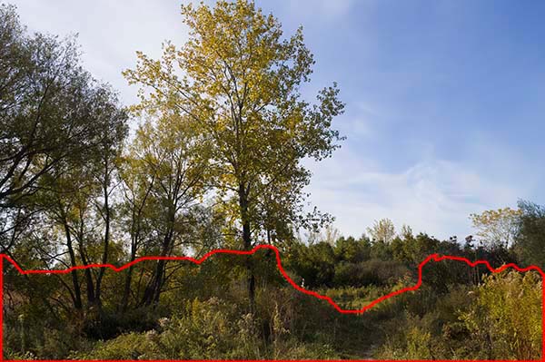
Fig. 12: Foreground/midground selection
1. Rough select foreground and midground; feather the selection; apply USM at 175/0.3/3.
2. Set history brush to before USM, strength about 30; examining at 100% and 200%, undo any haloes or crinkly detail.
3. Rough-select background trees and field above path on right; feather; apply gentler USM because of DOF blur.
E. Local changes 4: finishing touches
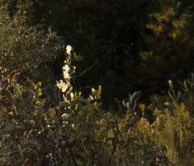
Fig. 13: glaring white upshoot
Now we have some difficult decisions to make; the kind that have no one right answer. Between the yellow pipe and the main tree is a glaring white upshoot (Fig. 13). We can clone (rubber stamp) this out, or we can set the clone tool opacity to a lowish number like 20 and tone it down, or we can leave as is. Your call. Left unchanged, the smaller you print this picture or the further you stand from a larger print, the more it will look like a little white blotch and the less it will be identifiable as vegetation. You could also defer the decision by first duplicating the background layer and making your change on the duplicate layer.
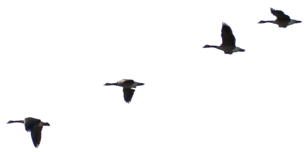
Fig. 14. Canadian geese against white cloud
Next up: the image we used for the first project had two Canadian geese nicely placed in the rectangle of blue sky (appropriate, since the locale for these shots is a local wetland and wildlife preserve). This current picture lacks that little compositional flourish. There is a whole school of eco-artists, such as Canadian Robert Bateman, who paint landscapes of animals and/or birds in their natural habitat. Such paintings sold gangbusters for a couple decades. It so happens that I took several grab shots of a flight of geese honking by literally five minutes before I took this frame ... well, let's just say synchronicity happens... ;) Is this composition complete without the geese? Are the geese an over-worked clicheé or just the right touch? Fortunately, in this case I don't need to make the final call. Just click on Fig. 14, download the geese, then add them if you want them. (Interestingly, because I didn't have time to set exposure when taking this shot, the combination of backlit cloud and over-exposure created a natural pure white background, ideal for removing via Photoshop's Select Color tool before copying the geese to the main image.)
F. Printing
If you've been following along and want to make a print, follow the instructions from the first project; nothing different needs to be done.
De-brief and challenge
The first project started with a lucky, nearly perfect exposure and did the minimum necessary to turn it into a final print. This project stared with a frame with lots of potential but with the one weakness that it was shot in less than ideal light – then we corrected that little oversight. Seductive is the dark side of the Force, is it not? ;)
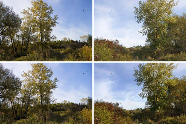
Fig. 15: Top = unmodified diptych, bottom = modified
Because these two images show literally two sides of the same scene and were shot at nearly the same time of day they have the potential to make a nice little diptych or to be hung together on the same wall. Only problem is that the very different editing has turned them into a Dr Jeckell and Mr Hyde pair; there's now very little visual similarity. So your homework, if you care to accept the challenge, is to re-edit the first image in the style of the second or vice versa. You won't have the apron-strings of a step-by-step guide to hold on to, so in theory you should learn a whole lot more... ;)