Digital Editing 102: Making it Sing
Project 3: tone sculpting
page 8, version 1.2, © 2009 by Dale Cotton, all rights reserved.
C. Local changes 2: contrast

Fig. 7: Sky contrast curve
1. Restore your saved sky selection. Open the Curves dialogue; click directly on the diagonal "curve" near the bottom left to keep from pulling the shadows down to blackness. Now make slight S-curve above that to increase contrast between darker and lighter portions of the sky. This change serves to bring out the inherent interest in the sky by increasing contrast.
Another possible issue in an image like this with a fairly straight horizon across the frame is that a bright sky and darker land would simply divide the image in two. In this case, the presence of the largish tree on the left, plus some light areas in the foreground, serve to save the composition from schizophrenia, so nothing needs to be done in that regard.
2. Invert sky selection so now the bottom half of the picture is selected.
The non-sky half of the image still shows the flat contrast of Lightroom's linear contrast "curve". How much we change that will strongly set the mood of the image. To some degree simply by printing the picture we will lower the contrast yet further, since paper has so little dynamic range compared to a monitor. Also, there is so much "activity" in this scene that strong contrast isn't needed just to keep the eye interested. If we simply apply an S-curve to the entire scene we will be adding yet more contrast to those areas that already have more than other areas. Instead, we want to apply contrast differently in different areas.
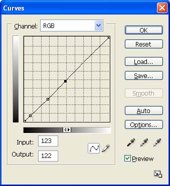
Fig. 8: Foreground contrast curve
3. Open Curves; again put a stop point near the bottom; play with S-curves to increase contrast; I settled on a very slight curve, since I like the original mood.
4. In the History pane click on the box to left of the step before the Curves event to set a source point; set history brush opacity to about 20-25%; then use the brush to undo some of the darkening in the darkest areas of the foreground.
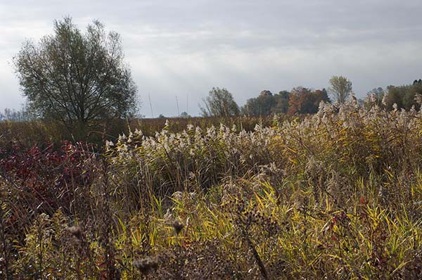
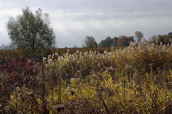
The energy of a picture is in its composition or design. Without energy a picture just sits there like a lump without inviting the viewer in. The energy of this picture is in the lines that flow from right to left and slightly downward like gently rolling waves, including the horizon and the tops of the cattails. We need a bit more energy, so let's emphasize these lines with added contrast. I call this process tone sculpting because we're modulating the original darks and lights for structural emphasis. A darkroom veteran would call it dodging and burning – different tools, same result. (In fact, if tone sculpting sounds a tad too pretentious, we could call this technique artful dodging, instead. ;)
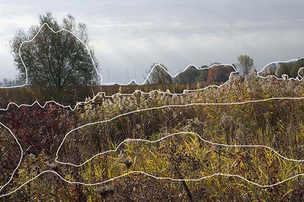
Fig. 10: "Waves" selections
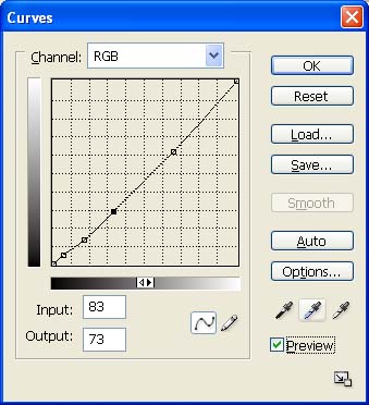
Fig. 11: Slight darkening curve
5. Using the Lasso selection tool quickly and roughly select the darker regions in the non-sky part of the scene with emphasis on their left-right connections. Omit the red foliage on the left, lest it become too dark (see Fig. 10). Feather about 50. Apply a slight darkening curve to this selection, then undo with History Brush as desired.
There is now a bit too much disjoint between the brightness of the sky and non-sky.
6. Restore the sky selection and create a curve with a slight dip in the main tonality of the sky to give a slight darkening. Fade as needed.
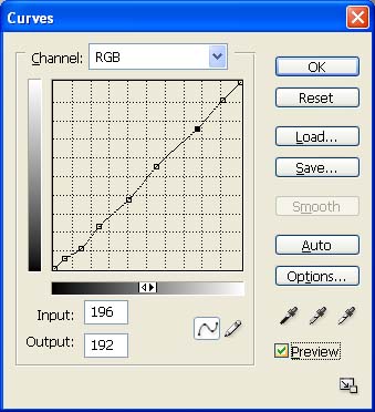
Fig. 12: Deepen shadows and increase contrast curve
7. Getting there, but the overall contrast still gives the impression of a slight haze over the image. Create a slight S-curve to deepen shadows and slightly increase contrast (Fig. 12).
The resulting colours shown in Fig. 13 are not only pleasing (to my eye, at least), they're actually much closer to what I remember from when I took the picture. But a side effect of the contrast curves we've employed is that the colours are now actually a tad too vivid compared to what was before the camera; I'll leave it to you whether to leave them this way (Velvia) or desaturate slightly (Provia).
Since this is not a printable image, there's no need to fuss with USM, so we're done.
Final de-brief
An interesting and sometimes humbling exercise at this point in the editing process, is to go back to the original raw version, whether before raw conversion adjustments (Fig. 2) or after (Fig. 4), and compare that to your current version (Fig. 13). Have you actually improved upon the original? The frightening thing, after hours of effort, is that the honest answer can sometimes be no.
The romantic's answer is that we can never improve upon nature. But nature's purposes are not our own. The very fact that we find any beauty at all in the natural world may well be the result of some fortuitous cross-connect between the part of our brains that drives mate selection and the part that parses the visual environment, ever scanning for opportunity and danger, profit and loss. If that be so then art, like laughter, is our way of exploiting a bizarre evolutionary aberration in order to add a bit of spice to lives that would otherwise endlessly swing between the poles of tedium and pain.
